2022

Health Tracking Gamified App for 45+

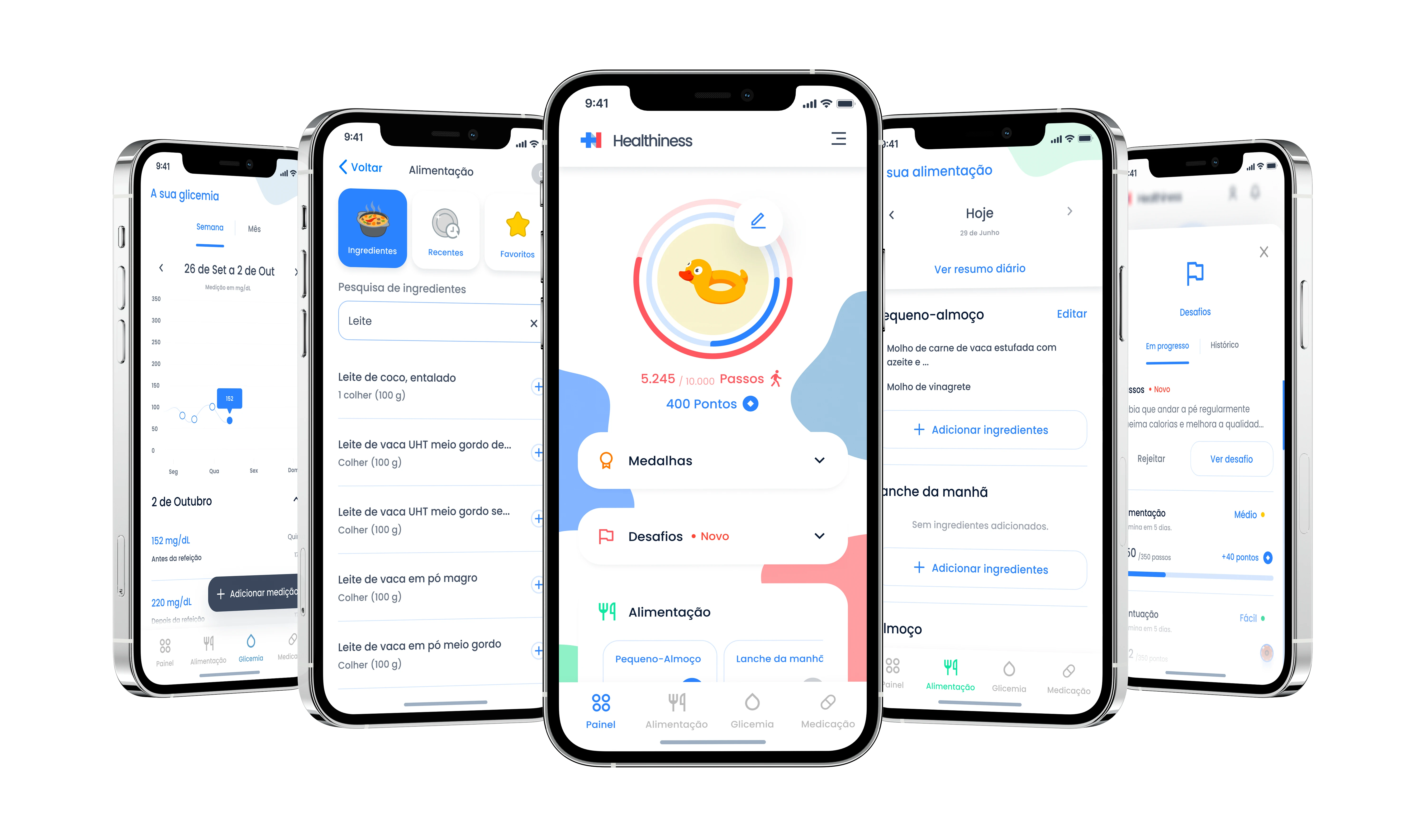
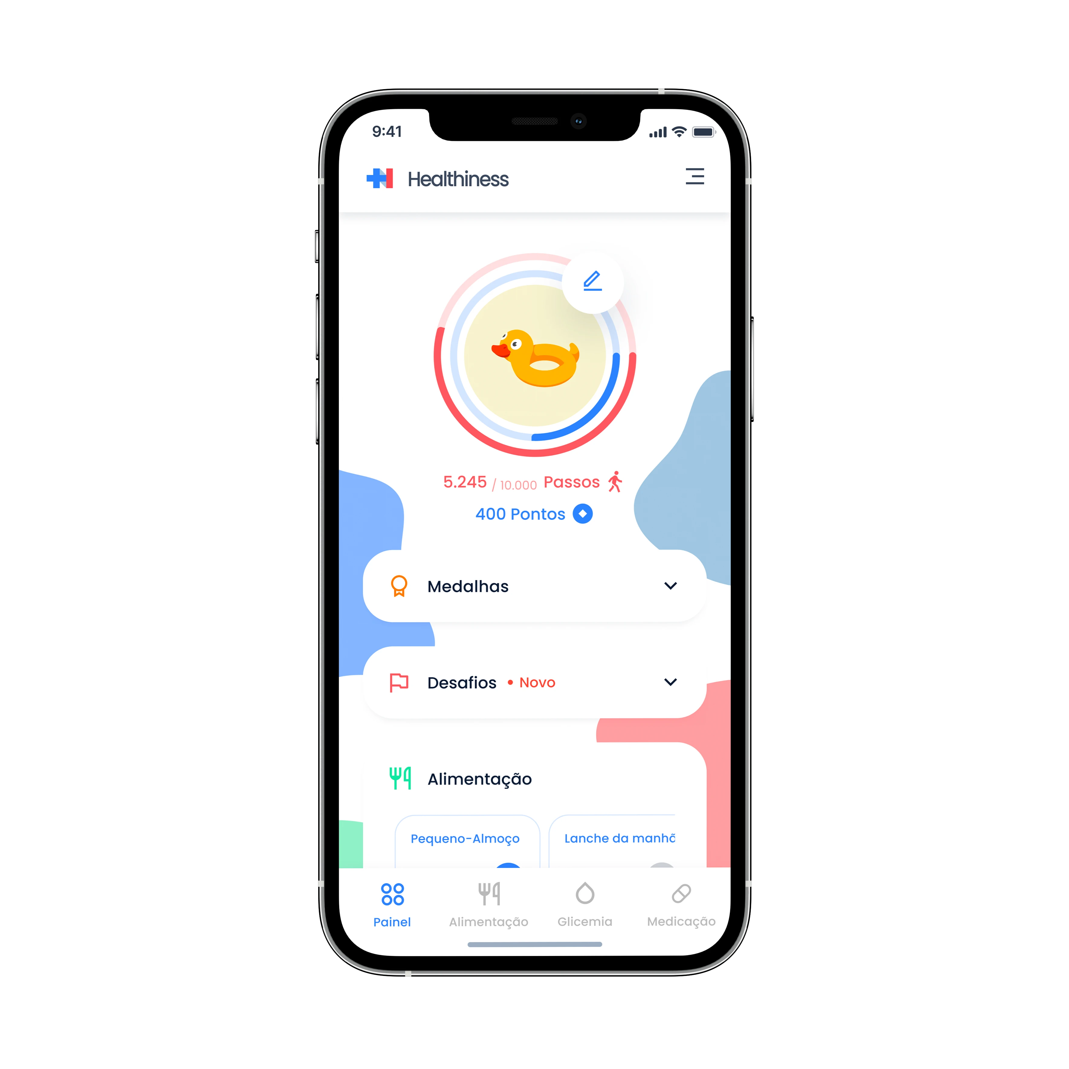
A health control mobile app for users with diabetes with the focus on controlling the glicemia levels with the use of gamification, challenges and motivational alerts.

Contribution

User surveys

Desk research

User personas

Competetive analysis

User flows

Wireframing

High fidelity layout

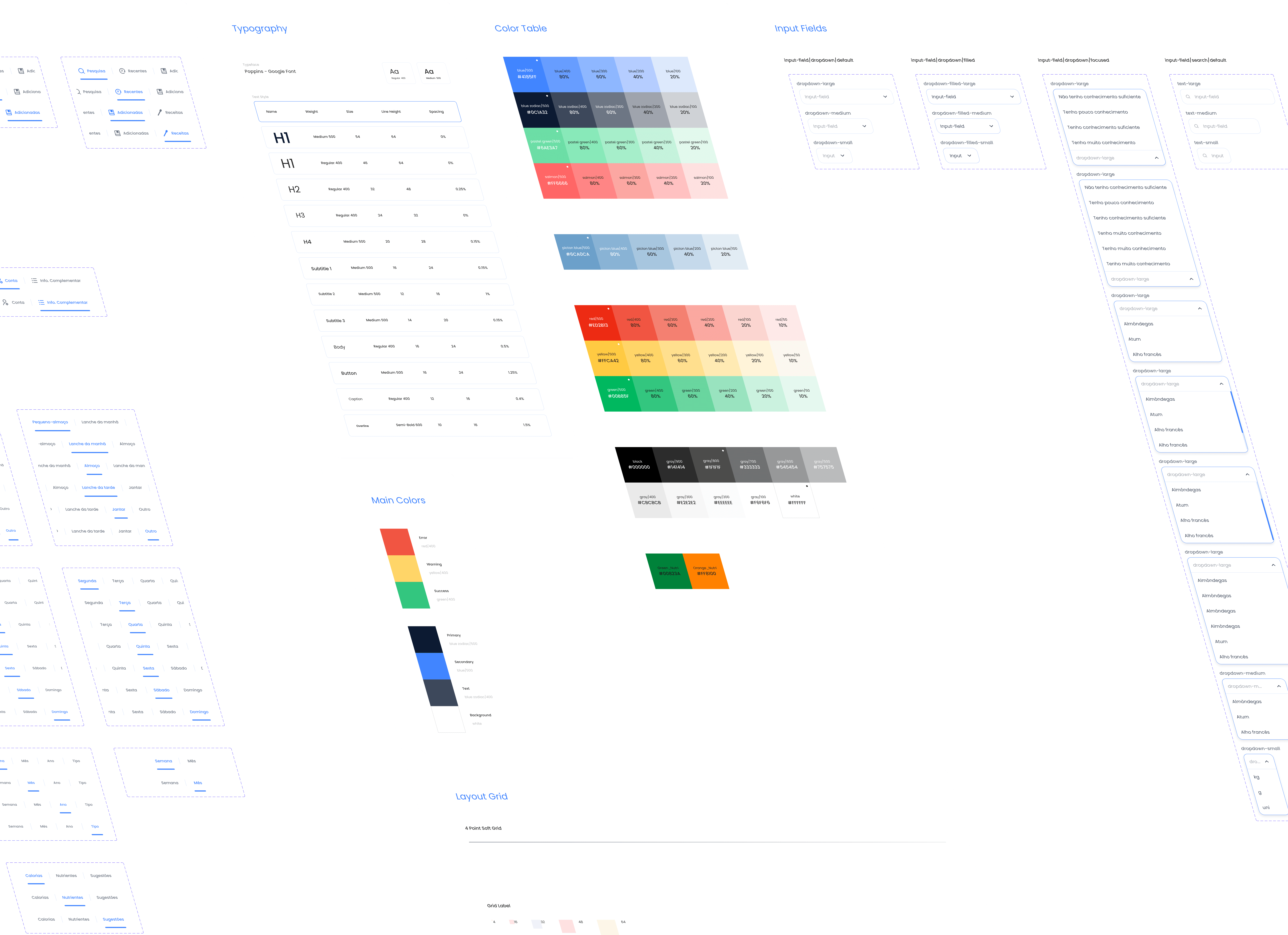
Design system

Prototyping

Design QA

Qualitative data analysis

User testing

Project details

Design challenge(s)

The official name of this project is Food Friend, in which 17 partners and 5 countries participate, funded by ITEA, an organization that enables companies to turn innovative ideas into new businesses, jobs, economic growth and benefits for society.

This project was made in collaboration with our Portugal partners at CLOO Behavioral Insights Unit, Polytechnic of Porto - School of Engineering (ISEP) and Faculty of Medicine - University of Porto (FMUP). Each partner was responsible for a key part in the development of this project, in which without them it would not have been possible.

The Challenge

How might we help subjects with type-2 diabetes in the monitoring of the disease and adherence to better lifestyle recommendations?
🎯 The mission was clear

Improve the quality of life and control of diabetes by helping patients manage their food intake, promote physical activity, apply coaching strategies, monitor medication, and improve glycemic control. The team was determined to create an evidence-based coaching solution that would empower patients to take control of their health.

☕ First things first

(Yea, i'm a big fan of coffee.) As this happened to be my initial undertaking with FYI, comprehension played a vital role in familiarizing myself with the project and colleagues. Collaboratively, we reviewed matters including user eligibility criteria, user exclusion criteria, and KPIs (their objectives and methods of substantiation) in order to authenticate this case analysis.

🚀 Embarking on the journey

The team and I were genuinely excited to get to work since this subject matter hit close to home with myself and some of my team members.

🚀 Embarking on the journey

The team and I were genuinely excited to get to work since this subject matter hit close to home with myself and some of my team members.

🚀 Embarking on the journey

The team and I were genuinely excited to get to work since this subject matter hit close to home with myself and some of my team members.

Insights gathered

Based on the results gathered, it was concluded that only one persona was necessary to accurately filter our decisions.

Insights gathered

Based on the results gathered, it was concluded that only one persona was necessary to accurately filter our decisions.

Insights gathered

Based on the results gathered, it was concluded that only one persona was necessary to accurately filter our decisions.

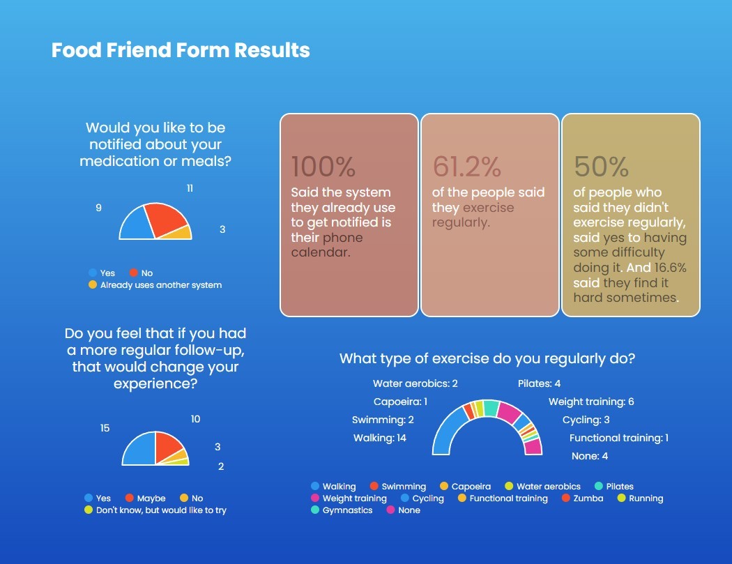
An example of the report done based on the survey results.

A user persona named Paulo was crafted.

A 59-year-old man living with diabetes for more than five years. Paulo's needs and preferences became a guiding light throughout the project.


51 people were recruited from Diabetes consultations in private practices in order to fill out this survey, which enabled me to create this persona.

Combining business requirements, plans and priorities for the product, as well as its direction.

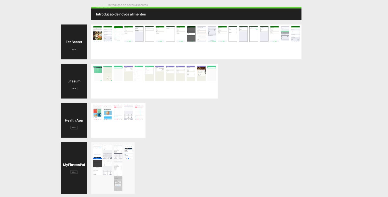
I started a Comparative Analysis with the current app market which this product would fit in order to find opportunities and what the app’s positioning would be towards its competitors.


In my research I found that, it’s main competitors would be:

  • Fat Secret

  • Lifesum

  • Google Fit

  • Health App

  • MyFitnessPal

Insights gathered

This stage required constant comunication between me and the Product Owner to better refine the story, which then would be translated into an app feature. In the beginning stages proved to be challenging due to not being familiar with the problem space.

Insights gathered

This stage required constant comunication between me and the Product Owner to better refine the story, which then would be translated into an app feature. In the beginning stages proved to be challenging due to not being familiar with the problem space.

Insights gathered

This stage required constant comunication between me and the Product Owner to better refine the story, which then would be translated into an app feature. In the beginning stages proved to be challenging due to not being familiar with the problem space.

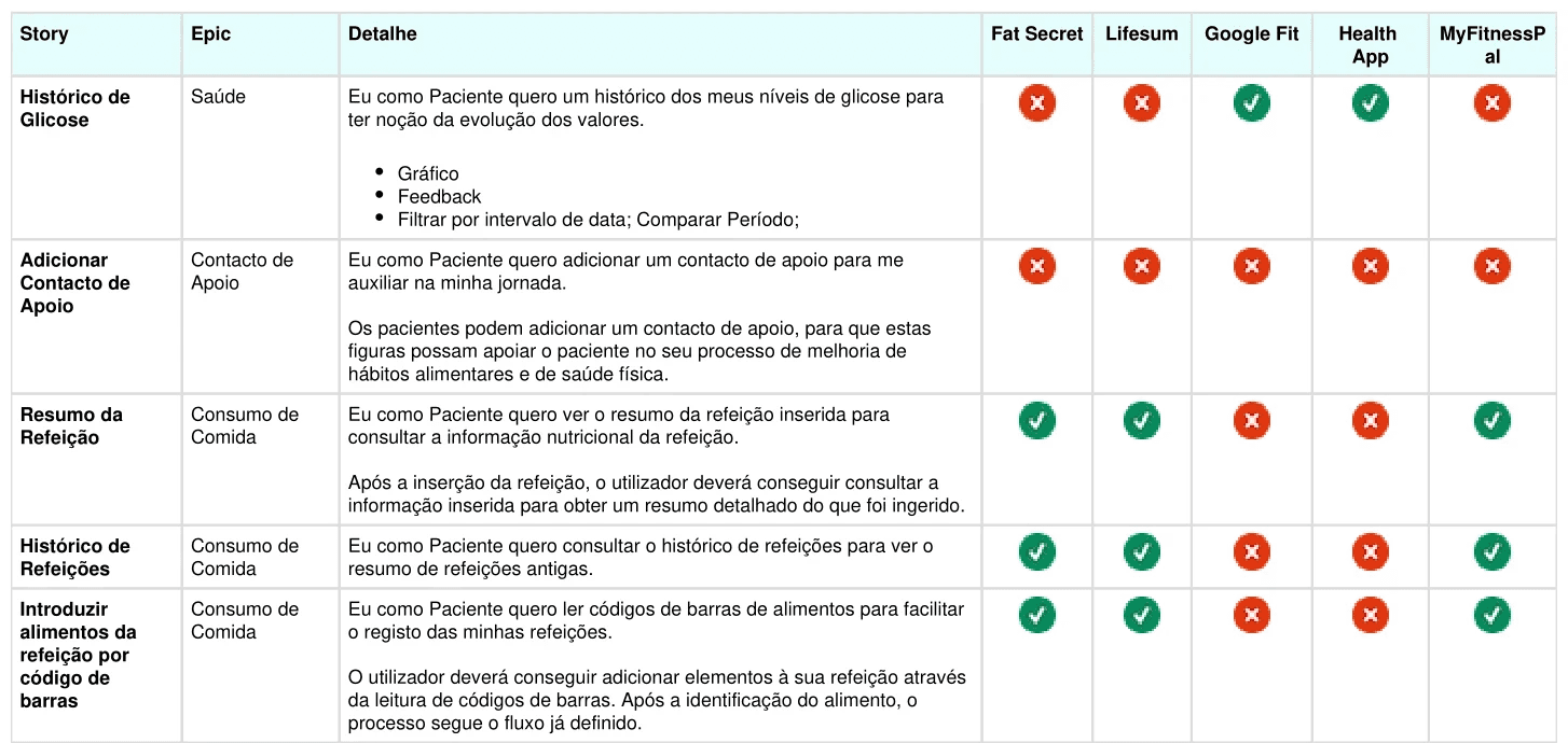
A small example of the competitior analysis done.

Insights gathered

Even though several apps were compared with one another (their flow might be otimized to a younger audince with advanced gestures), some had to be taken with a grain of salt since their target audience wouldn't necessarily be the same as ours.

Insights gathered

Even though several apps were compared with one another (their flow might be otimized to a younger audince with advanced gestures), some had to be taken with a grain of salt since their target audience wouldn't necessarily be the same as ours.

Insights gathered

Even though several apps were compared with one another (their flow might be otimized to a younger audince with advanced gestures), some had to be taken with a grain of salt since their target audience wouldn't necessarily be the same as ours.

A single example of the feature comparative analysis made. I ended up comparing more than 21 different features.

I then started comparing the flows of each feature in order to find optimizing opportunities.

Even though it's main competitors would be those listed before, i found it useful to search beyond our competitors, in a feature based comparative analysis.


For this analysis different apps would be better suited for different features.

🗿 Molding the clay

Now i had a pretty good understanding of the problem space and the requirements of the project. It was time to start iterating.

🗿 Molding the clay

Now i had a pretty good understanding of the problem space and the requirements of the project. It was time to start iterating.

🗿 Molding the clay

Now i had a pretty good understanding of the problem space and the requirements of the project. It was time to start iterating.

I started to iterate on the first userflow

With the comparative analysis and the flow comparison in mind, I started to create the first rudimentary version of the app's user flow, which would later on would be iterated upon 5 more times with increasingly more complex flows.


The iterations were a result of added features, feature optimization and usability testing results.

This is the final iteration of the app's userflow.
Info

Unfortunately we were unable to recruit users at this time due to various business constraints. We would be able to test with users that aligned with our persona later on, when the app was already developed.

Info

Unfortunately we were unable to recruit users at this time due to various business constraints. We would be able to test with users that aligned with our persona later on, when the app was already developed.

Info

Unfortunately we were unable to recruit users at this time due to various business constraints. We would be able to test with users that aligned with our persona later on, when the app was already developed.

An example of the wireframe prototype done.

Wireframe layouts and low fidelity prototype

With the wireframes created, I prototyped the app with the wireframes screens to share with the rest of the stakeholders in order to receive feedback.

Back to ideating

After iterating on the Stakeholders feedback and updating some wireframes and user flows, I started to move on to the high fidelity designs, where we could have a better grasp of what the app will look like. At the same time, I started to slowly develop the app’s (and later on web app's) Design System. 


Constant communication with the developers, both internal and external (ISEP partner) and the rest of the Stakeholders (CLOO and FMUP) was a key at this stage.

Info

Throughout the development of the app, I was also in charge of the Design Quality Assurance and its documentation, since it’s essential to better communicate to the development team.

Info

Throughout the development of the app, I was also in charge of the Design Quality Assurance and its documentation, since it’s essential to better communicate to the development team.

Info

Throughout the development of the app, I was also in charge of the Design Quality Assurance and its documentation, since it’s essential to better communicate to the development team.

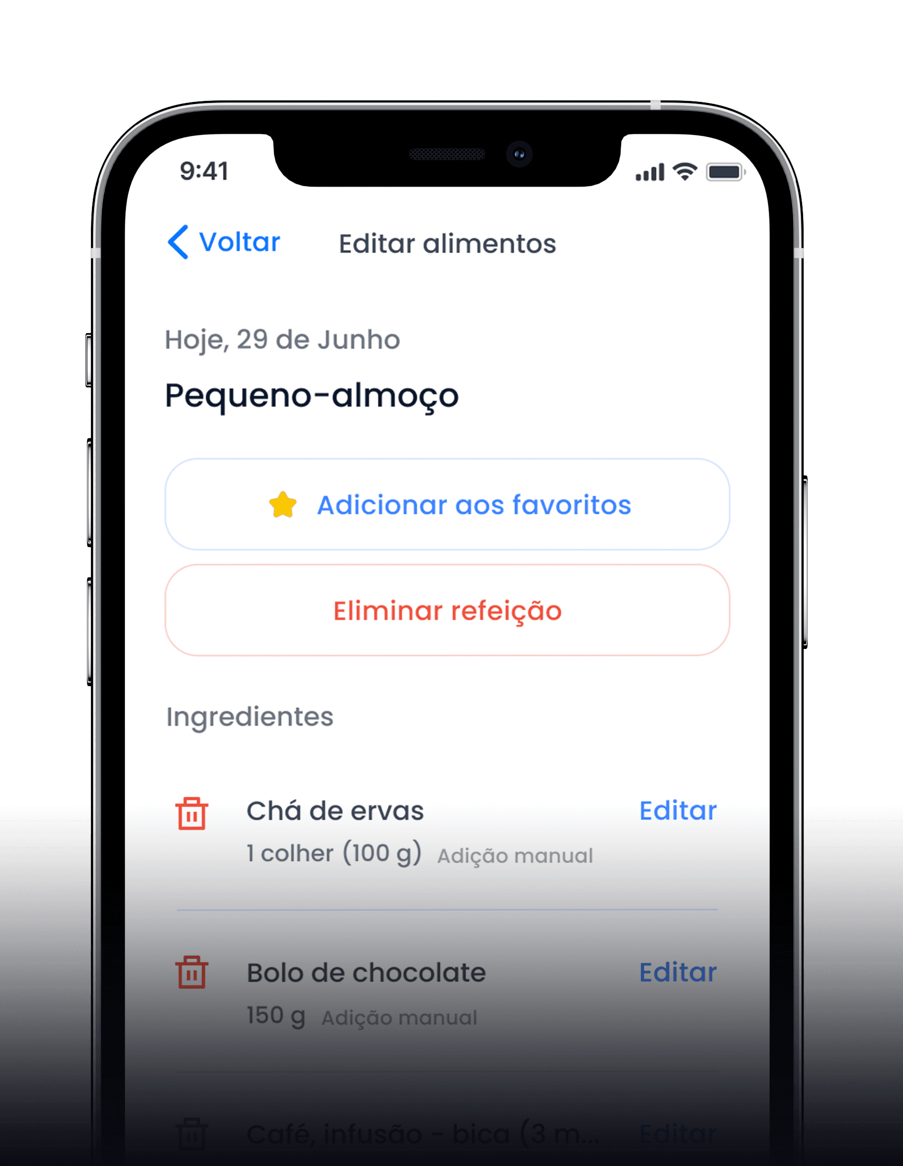
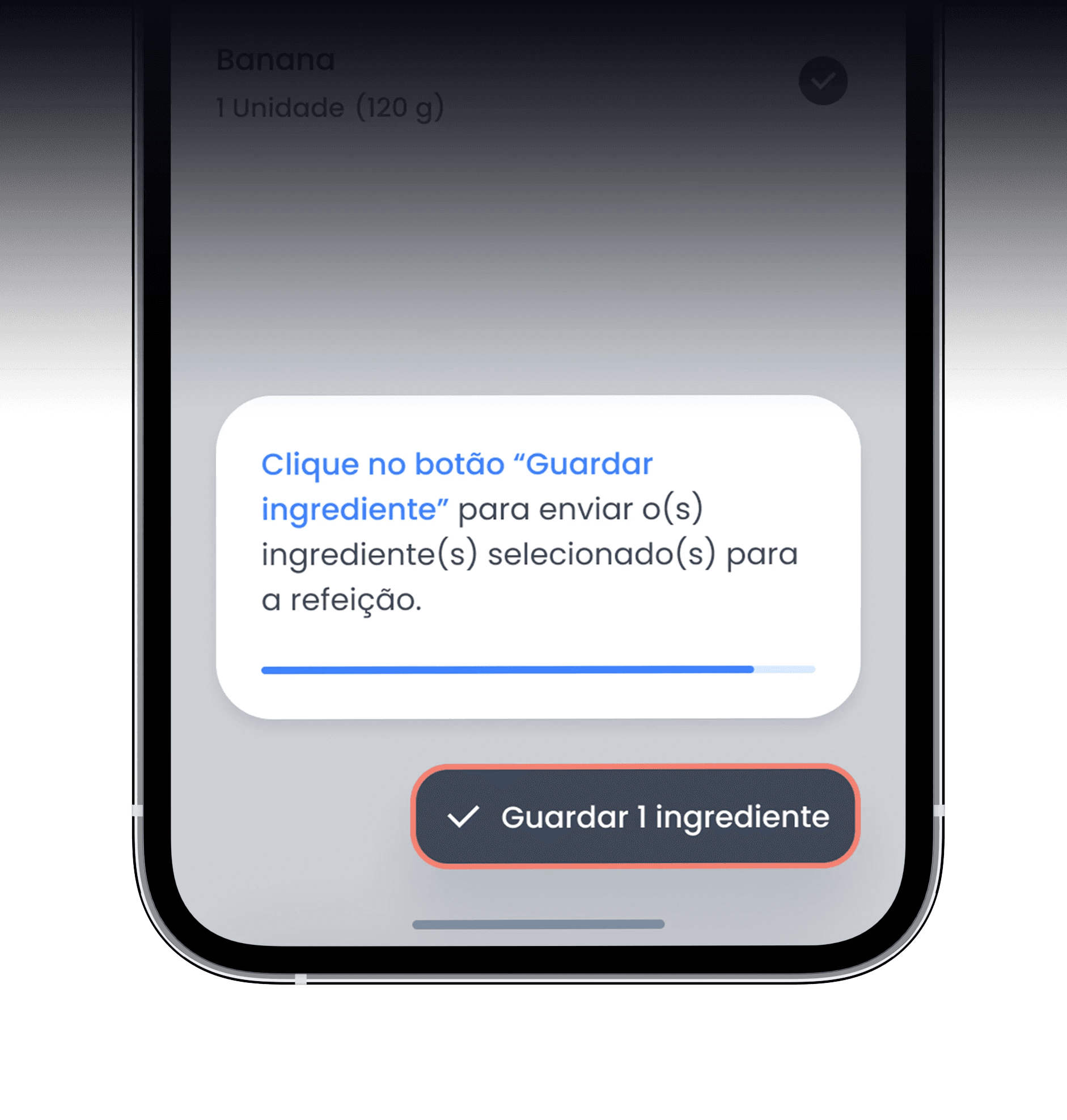
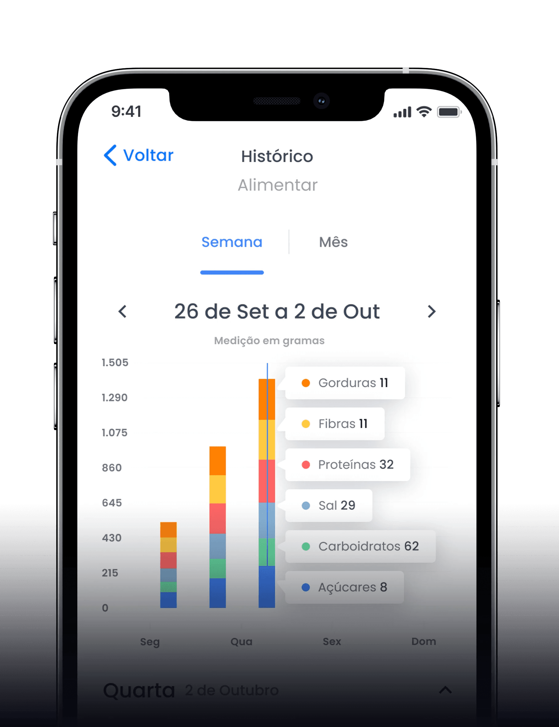
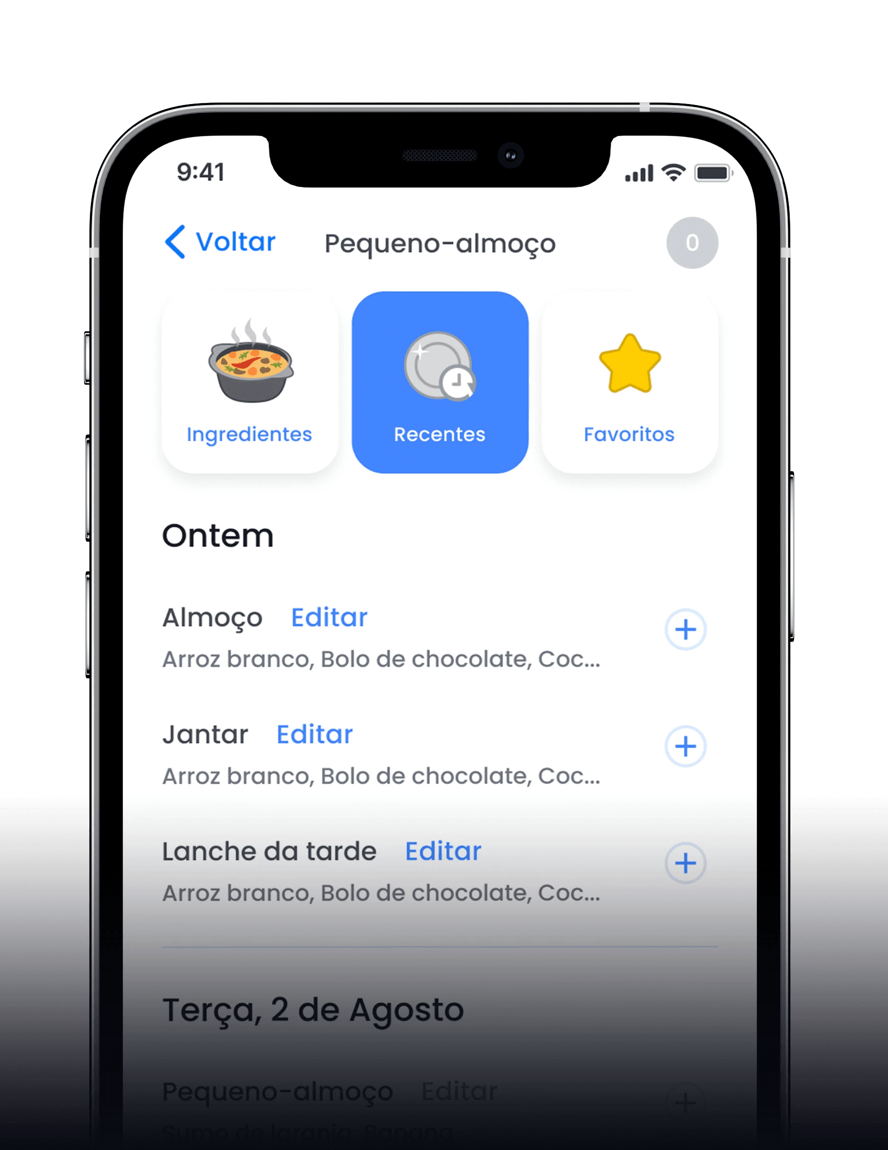
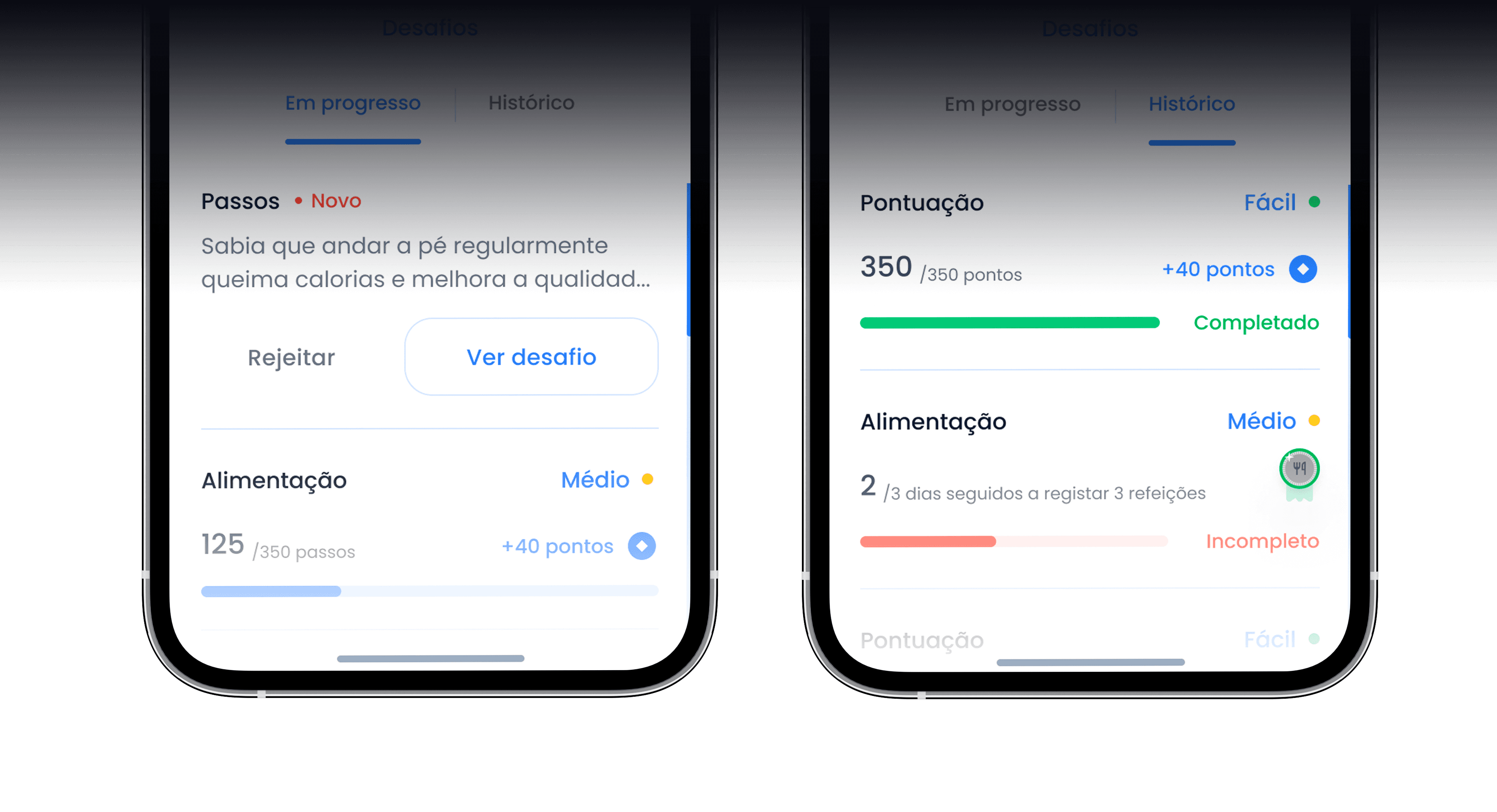
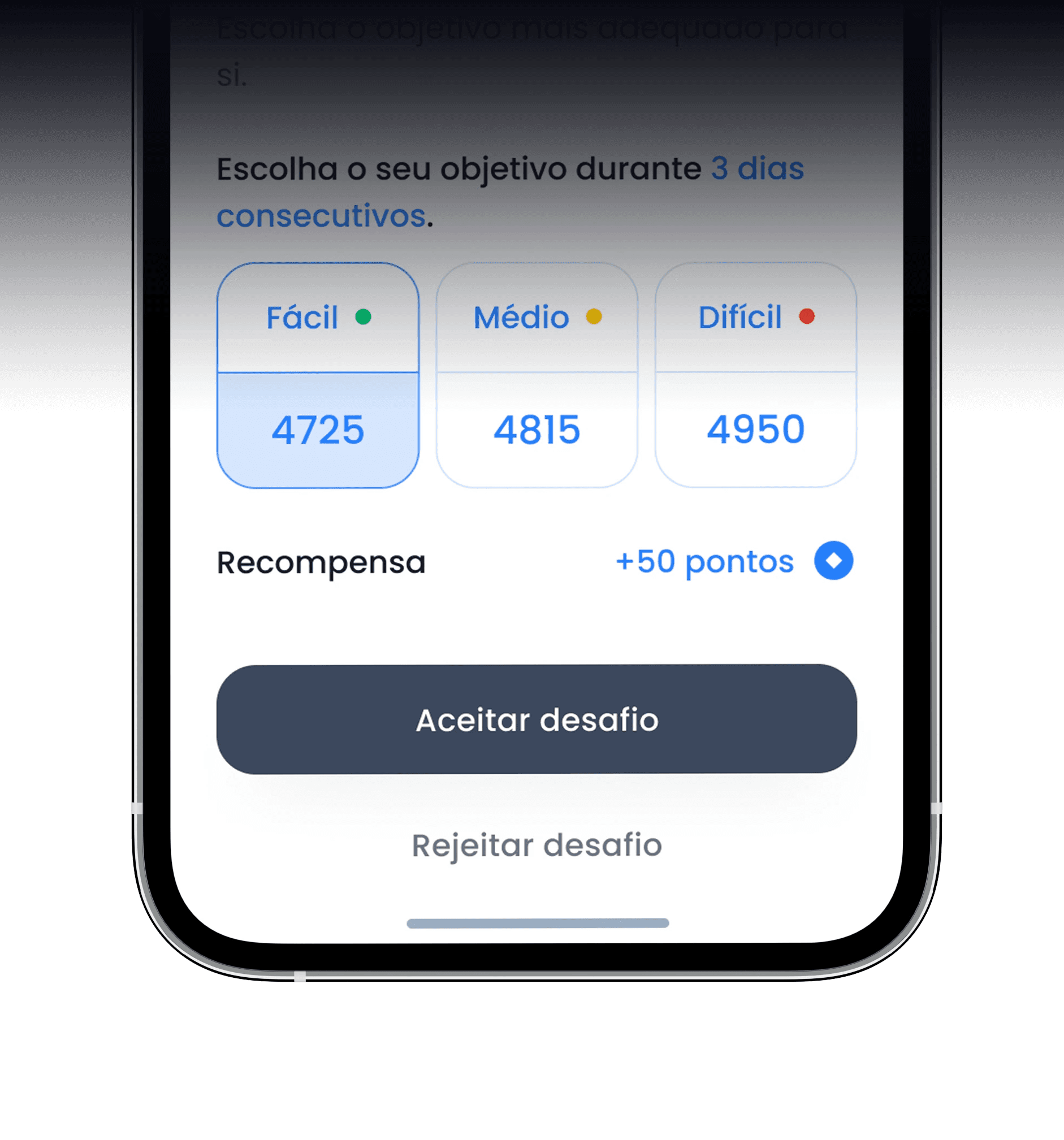
A high fidelity propotype showcasing the meal flow, which proved to be the most complex flow of the app.
🚥 Going for a test-drive

After further communication with the stakeholders, we were given the green light to carry out a long overdue moderated usability test with our target users in order to validate these hypotheses and iterate upon real feedback.

🚥 Going for a test-drive

After further communication with the stakeholders, we were given the green light to carry out a long overdue moderated usability test with our target users in order to validate these hypotheses and iterate upon real feedback.

🚥 Going for a test-drive

After further communication with the stakeholders, we were given the green light to carry out a long overdue moderated usability test with our target users in order to validate these hypotheses and iterate upon real feedback.

For our usability test we were able to recruit 6 users who fit our user persona and these were some insights that we’ve gathered.

From this usability test, we were able to find 24 new improvements we could make to the app in order to improve it's user experience, below you’ll find some of the suggestions, the reasoning behind them, our effort to implement them and the impact it could have to the user.

83 %

of tasks were completed including all the users and tasks performed.

More information

83 %

of tasks were completed including all the users and tasks performed.

More information

83 %

of tasks were completed including all the users and tasks performed.

More information

Meal and glicemia insertion bottomsheet

Reasoning

The user had trouble in finding the humor thermometer after the type of meal/measurement schedule.

  1. User 2 thinks it should be more explicit in to what it means.

  2. It would be faster, from possibly 4 clicks to 2. Aswell as being helpful for smaller screen sizes to remove the primary button.

  3. Some users didn't want to register their humor.

Suggestion

Humor thermometer in the bottomsheet needs to be separated from the type of meal/measurement schedule, either by collapsing the previous field or a whole new bottomsheet. User 2 thinks it should be more explicit in it's meaning.

  1. Update the humor thermometer buttons to have an outline and change the icons to text (Happy, Neutral, Upset).

  2. After selecting the type of meal/measurement schedule it would go to the next step, without the need to have a primary button.

  3. Even though it would be useful to have a registry of the humor thermometer everytime the user registers a meal or glicemia, the continue button should be optional in order not to impact the task success rate due to the user not wanting to answer.

Onboarding

Reasoning

Users will be more comfortable using the app if they performed those tasks already in a controlled environment.

Suggestion

Switch the current onboarding form to a hint based onboarding, making the user make certain tasks, so it learns how to better use the app.

Onboarding

Reasoning

Users will be more comfortable using the app if they performed those tasks already in a controlled environment.

Suggestion

Switch the current onboarding form to a hint based onboarding, making the user make certain tasks, so it learns how to better use the app.

Onboarding

Reasoning

Users will be more comfortable using the app if they performed those tasks already in a controlled environment.

Suggestion

Switch the current onboarding form to a hint based onboarding, making the user make certain tasks, so it learns how to better use the app.

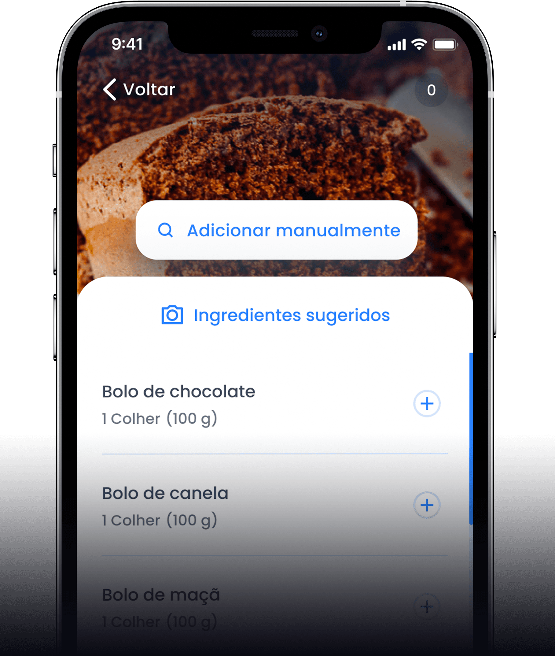
Adding a meal

Reasoning

Users 3 and 5 had trouble finding the search by photo button in the screen.

Suggestion

Add a label to search by photo in the meal screen.

Adding a meal

Reasoning

Users 3 and 5 had trouble finding the search by photo button in the screen.

Suggestion

Add a label to search by photo in the meal screen.

Adding a meal

Reasoning

Users 3 and 5 had trouble finding the search by photo button in the screen.

Suggestion

Add a label to search by photo in the meal screen.

Adding a meal

Reasoning

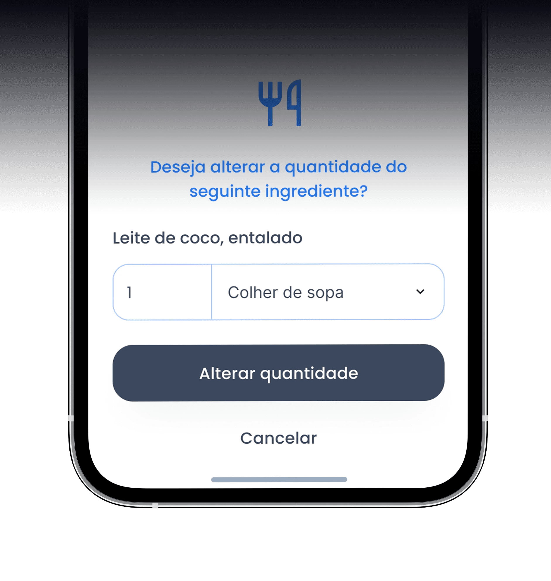
55% of guesses in Task 6, regarding how many grams of food were in the image were wrong.

Suggestion

For each ingredient, add the recommended portion and dosage type.

Adding a meal

Reasoning

55% of guesses in Task 6, regarding how many grams of food were in the image were wrong.

Suggestion

For each ingredient, add the recommended portion and dosage type.

Adding a meal

Reasoning

55% of guesses in Task 6, regarding how many grams of food were in the image were wrong.

Suggestion

For each ingredient, add the recommended portion and dosage type.

Following the moderated usability test, we asked the participants to answer a questionaire in order to validate further developments.
100 %

of users used the Android Operating system.

More information

100 %

of users used the Android Operating system.

More information

100 %

of users used the Android Operating system.

More information

100 %

of users prefered receiving their validation code (OTP) through SMS.

More information

100 %

of users prefered receiving their validation code (OTP) through SMS.

More information

100 %

of users prefered receiving their validation code (OTP) through SMS.

More information

67 %

of users prefer having an ilustration as opposed to a personal picture as an in-app avatar.

More information

67 %

of users prefer having an ilustration as opposed to a personal picture as an in-app avatar.

More information

67 %

of users prefer having an ilustration as opposed to a personal picture as an in-app avatar.

More information

64 p

scored regarding SUS – System Usability Scale

More information

64 p

scored regarding SUS – System Usability Scale

More information

64 p

scored regarding SUS – System Usability Scale

More information

23.5 p

scored regarding USEQ - User Satisfaction Evaluation Questionnaire

More information

23.5 p

scored regarding USEQ - User Satisfaction Evaluation Questionnaire

More information

23.5 p

scored regarding USEQ - User Satisfaction Evaluation Questionnaire

More information

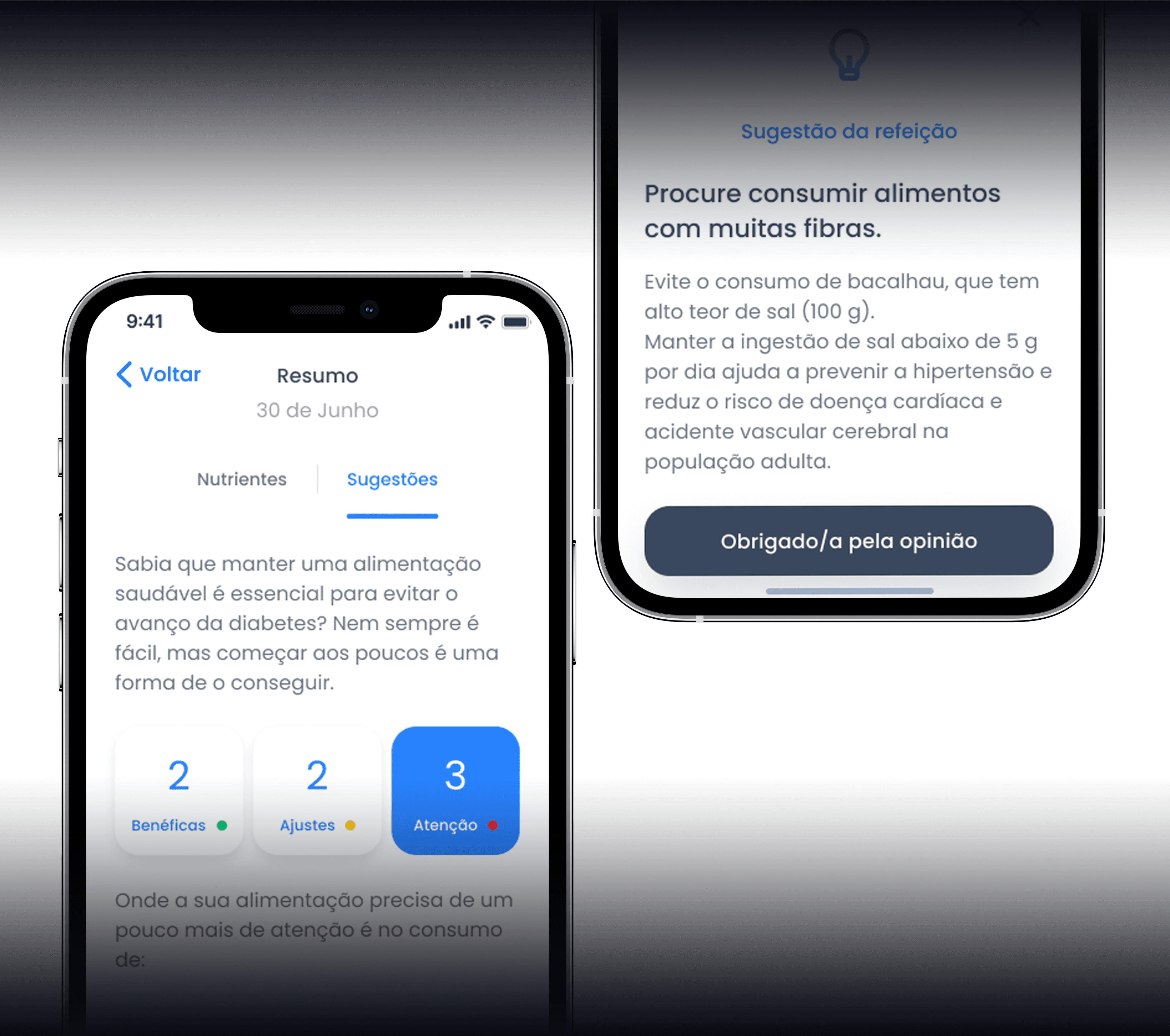
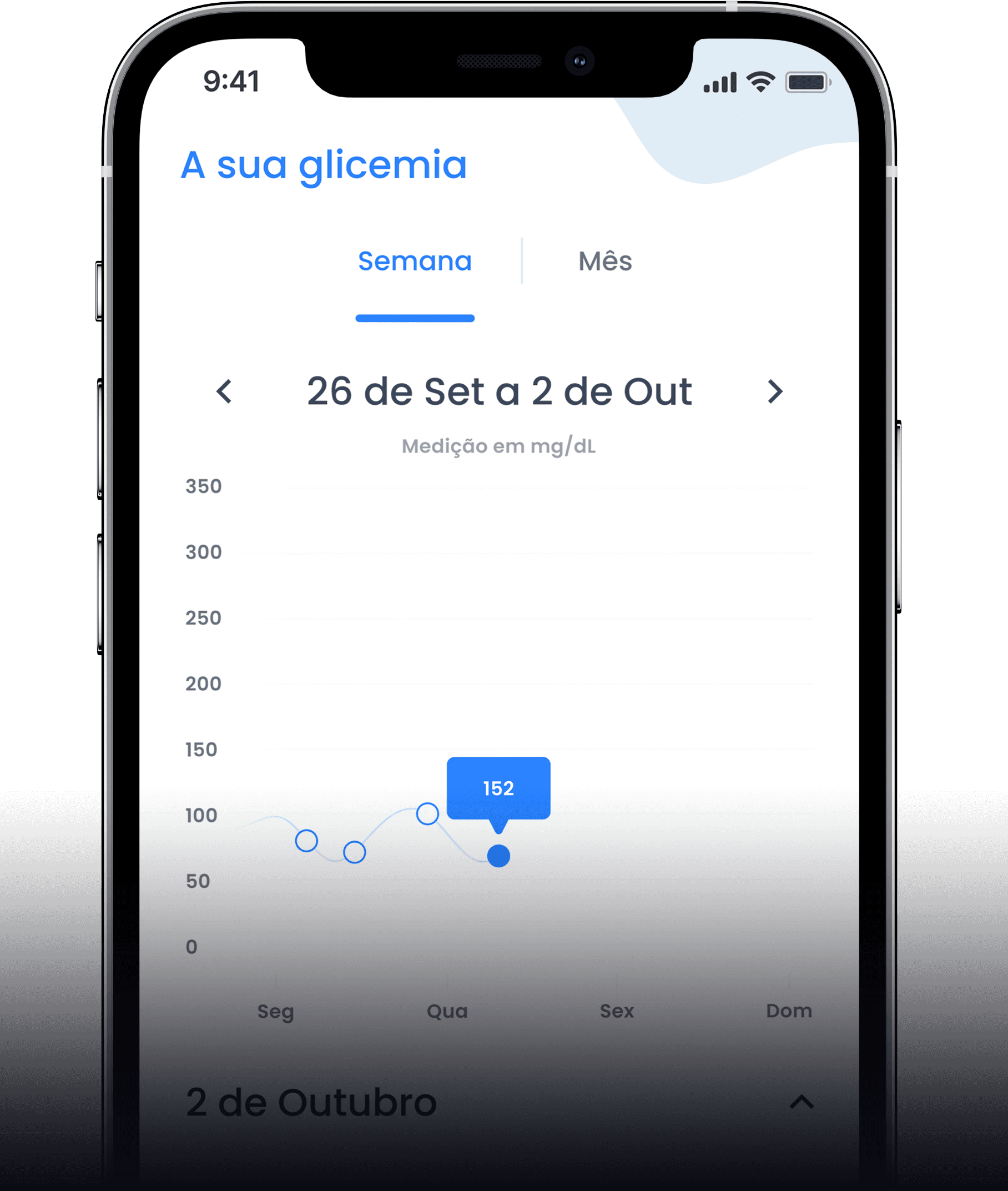
Some examples of the first iteration of high fidelity designs

After a couple of months a presential meeting was scheduled with all the worldwide partners

All the worldwide partners made a presentation about their project, and before our presential meeting I was tasked to make a promotional video in order to better communicate our project to the rest of the worldwide partners.
💭 Time to reflect

Working with FMUP was a delight as it allowed us to leverage their expertise in human psychology into notifications and gamification, motivating users to enhance their health. This experience underscored the distinct nuances between Apple Human Interface Guidelines and Google Material Design Guidelines, shedding light on the interaction disparities between mobile apps and websites. It emphasized the critical nature of meticulous attention to detail in mobile app design, a factor that can truly define a user's experience when executed thoughtfully or overlooked.

🎉 Team credits

This project wouldn't have been able to succeed without these amazing people

  • Nathália Munhoz (Product Owner)

  • André Crespo (Senior UX Designer)

  • Gonçalo Miranda (Flutter Developer)

  • Gabriel Pereira (Flutter Developer)

  • Paulo Silva (Tech Lead)

Designed in Figma and implemented in Framer by Daniel Marques.

Designed in Figma and implemented in Framer by Daniel Marques.

Designed in Figma and implemented in Framer by Daniel Marques.