2024 - Present

User-Effort-Optimized CMS

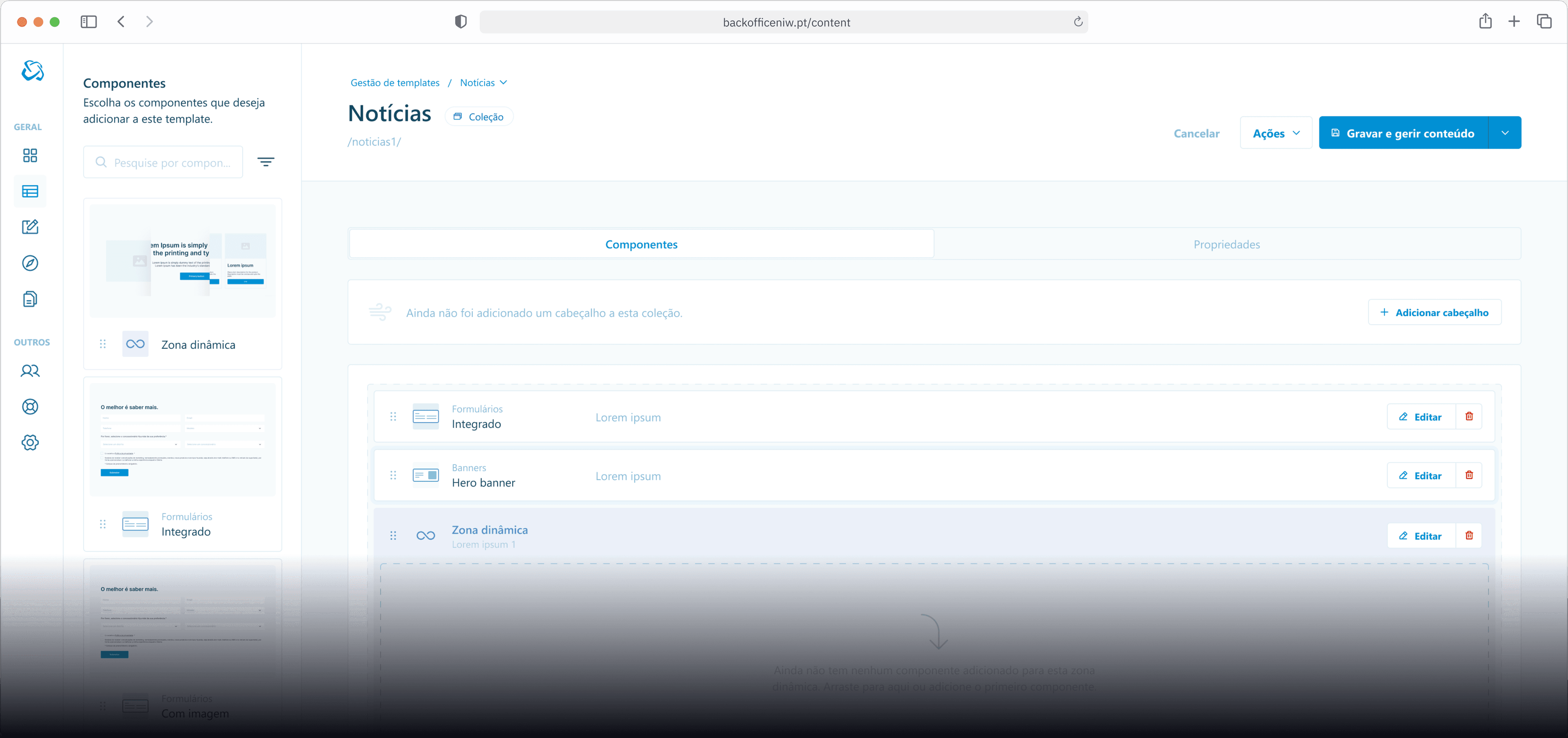
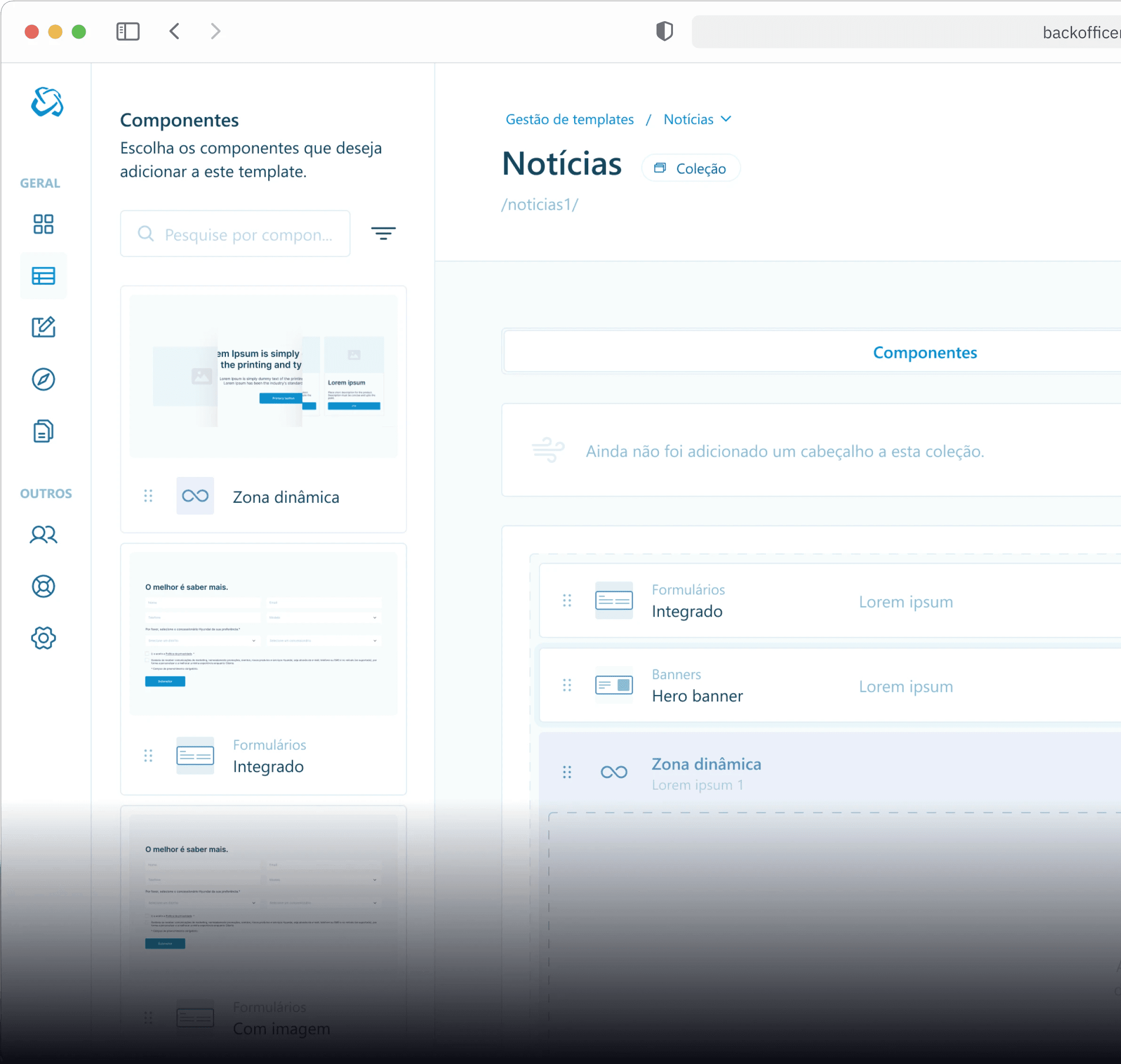
A CMS that prioritizes user effort. By integrating rigorous user testing and efficient workflows, our CMS solution empowers users to effortlessly manage their content, saving time and enhancing productivity.

Contribution

User persona

Desk research

Competetive analysis

User flows

Wireframing

High fidelity layout

Design system

Prototyping

Design QA

Qualitative data analysis

User testing

Project details

Design challenge(s)

This project started with the need to migrate from our go to cms website solution, Wordpress, to a new, more user-friendly, effort optimized CMS in order to reduce support tickets, enhance productivity and increase user autonomy in managing an automotive website's content.

The Challenge

How might we reduce user effort and increase usability in managing a website's content?

🧭 What are we aiming for?

As this project was developed for internal use, our primary focus was on aligning its functionalities with our various brands by creating an initial MVP. Our aim was to seamlessly integrate the product across all our brand portfolios and ensuring a consistent rollout of features.

🧱 Laying the foundation

What are we actually trying to build? What features should the MVP have in order to accomodate the most amount of our brand's websites? Who will use this product? Those are some of the questions we should have an answer to, in order to have a good product foundation.

🧱 Laying the foundation

What are we actually trying to build? What features should the MVP have in order to accomodate the most amount of our brand's websites? Who will use this product? Those are some of the questions we should have an answer to, in order to have a good product foundation.

🧱 Laying the foundation

What are we actually trying to build? What features should the MVP have in order to accomodate the most amount of our brand's websites? Who will use this product? Those are some of the questions we should have an answer to, in order to have a good product foundation.

Who are we building this for?

A survey was sent out to the company that manages our brands content in order to inform our User Persona.

Insights gathered

Our User Persona ended up being a 28 year old Woman, with 2 years of managing Wordpress backoffices. Their pain points were mainly work duplication, error handling and ease of use.

Insights gathered

Our User Persona ended up being a 28 year old Woman, with 2 years of managing Wordpress backoffices. Their pain points were mainly work duplication, error handling and ease of use.

Insights gathered

Our User Persona ended up being a 28 year old Woman, with 2 years of managing Wordpress backoffices. Their pain points were mainly work duplication, error handling and ease of use.

Insights gathered

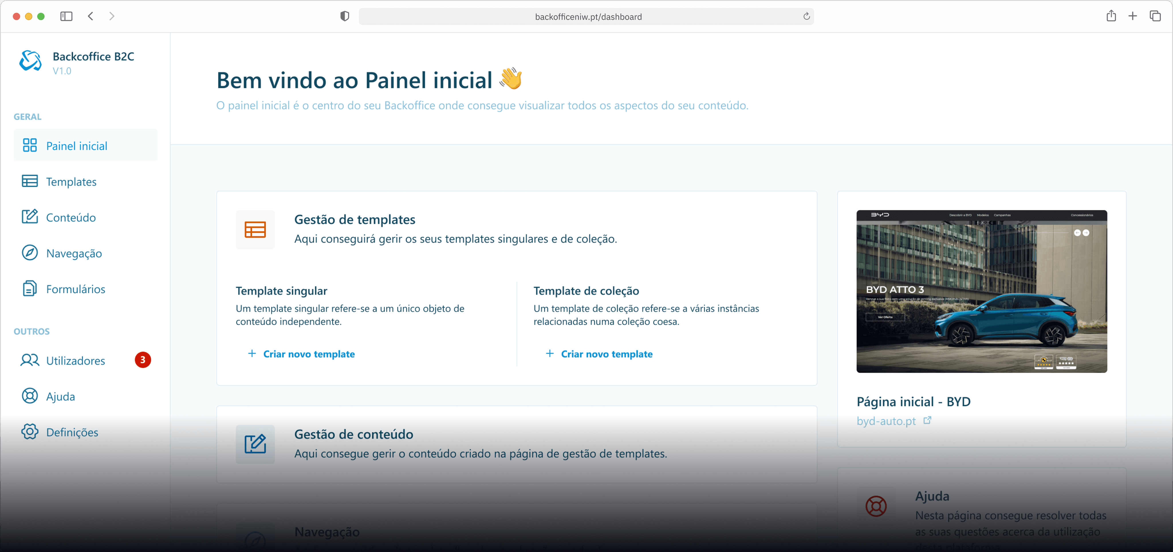
A key feature we discovered in this process and thought would make sense to implement was a collection page and single page template. This feature would help optimize the user effort, since it was one of the main pain points we found, among others we'll talk about further down the process.

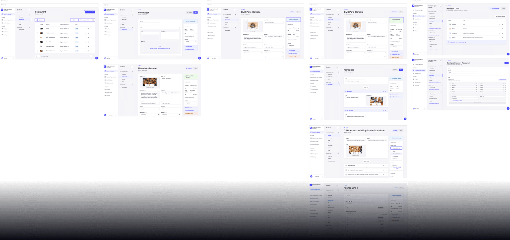
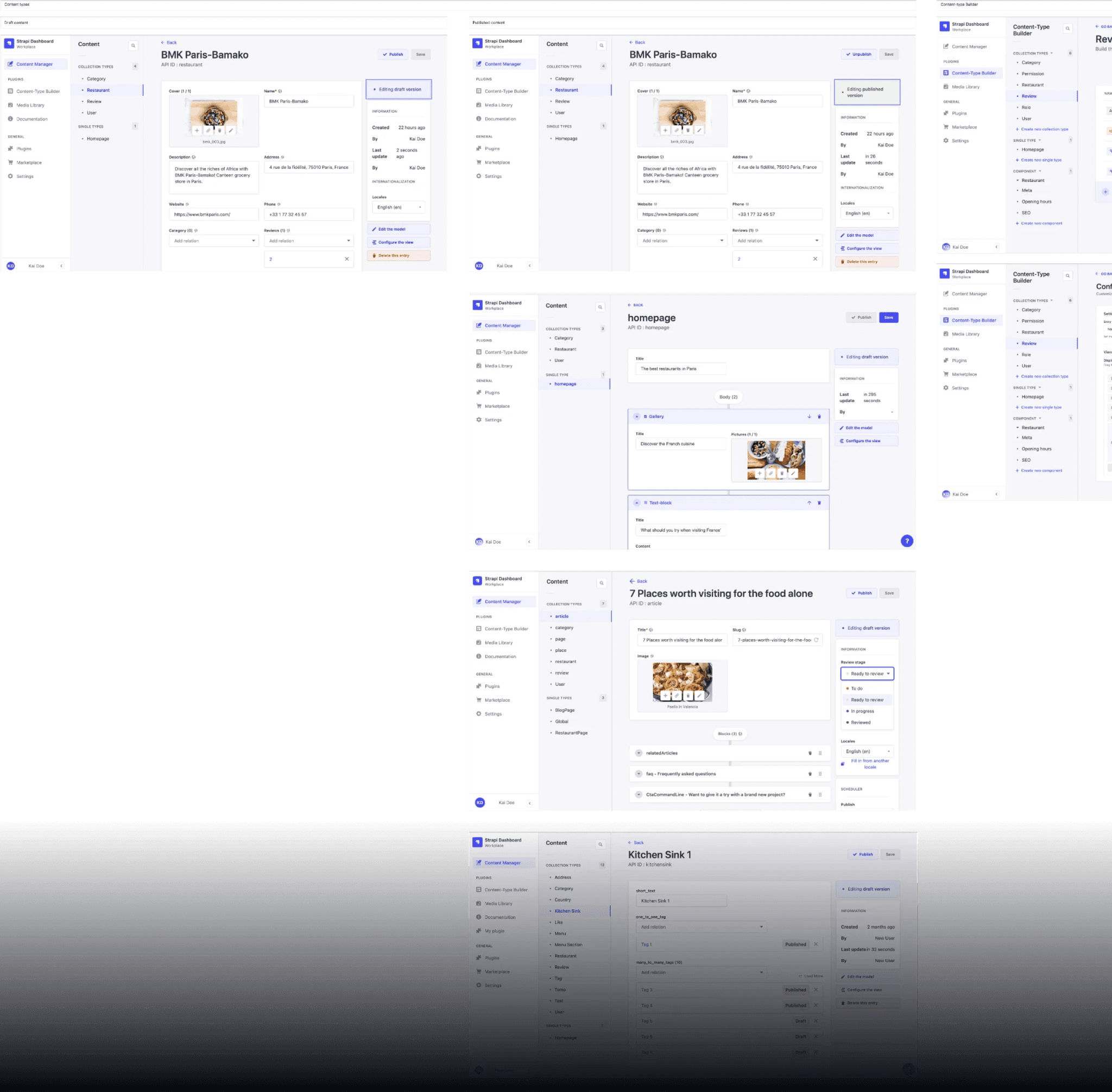
A small example of the competitor analysis done.

Meeting the competition

I started a Comparative Analysis with the current app market which this product would fit in order to find opportunities and what the product’s positioning would be towards its competitors.


In my research I found that it’s main competitors would be:

  • Strapi

  • Contentful

  • Prepr

How might we reduce user effort and increase usability in managing a website's content?

Solutions found:

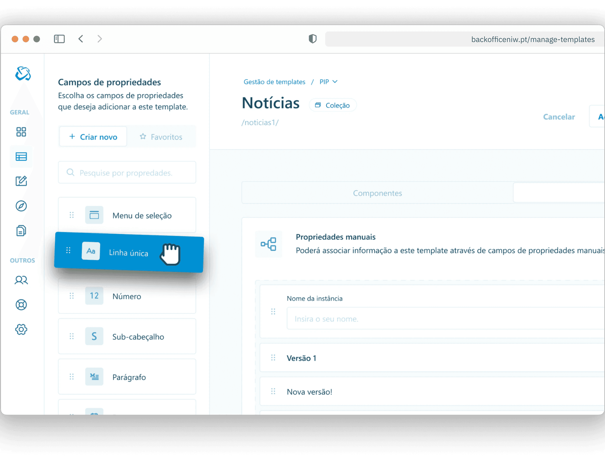
  • Collection and Single page templates

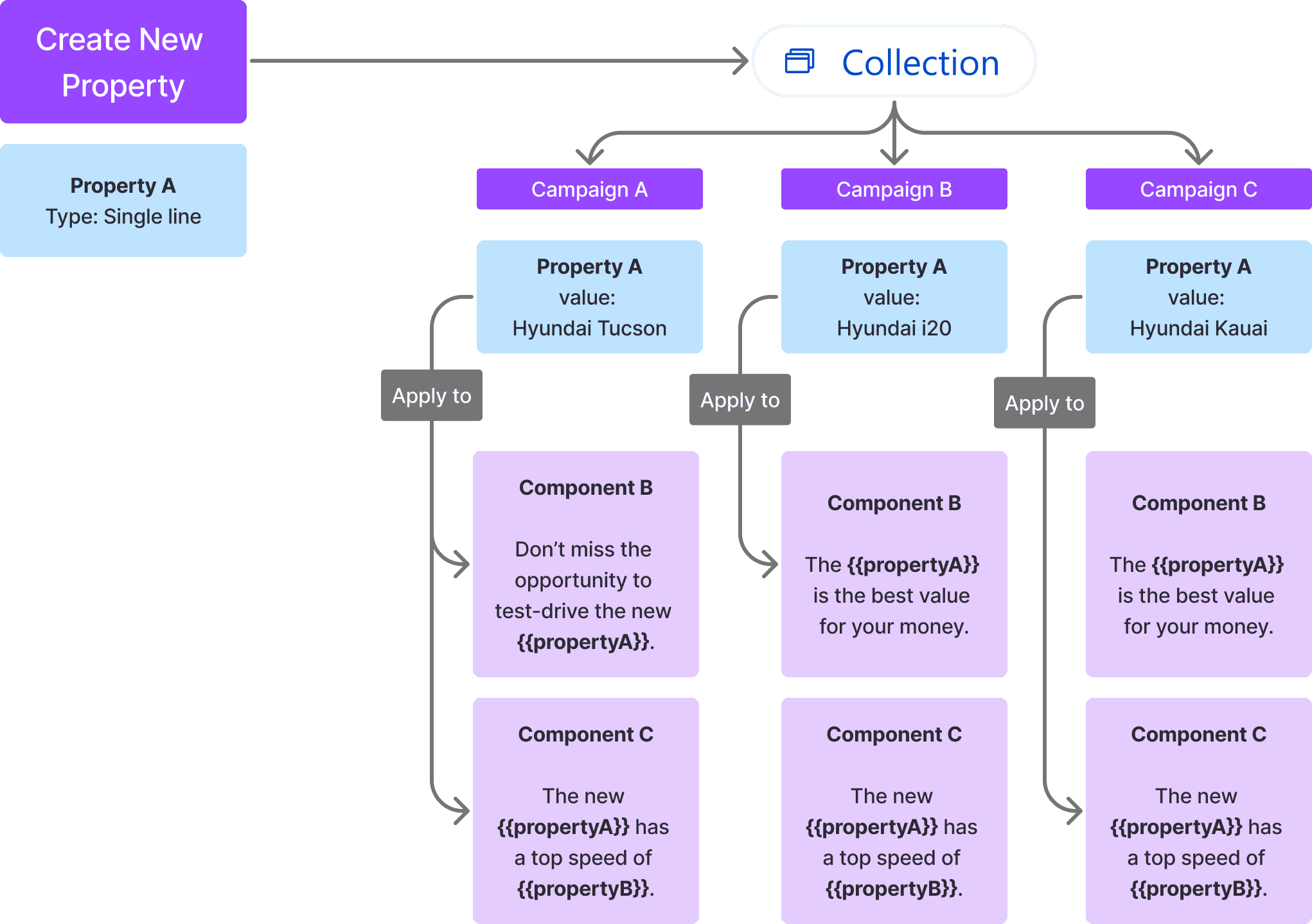
  • Template properties (Content variables)

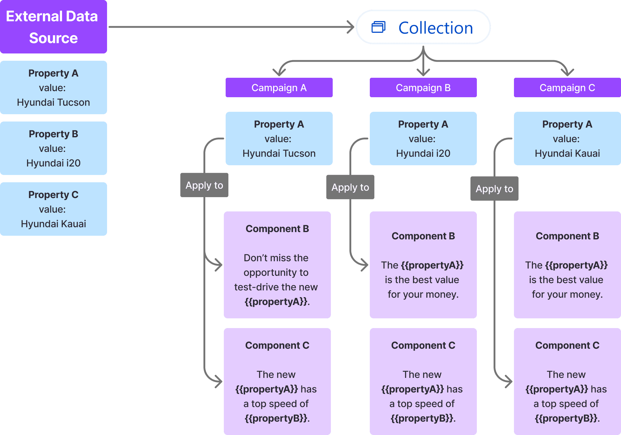
  • Data source fed content

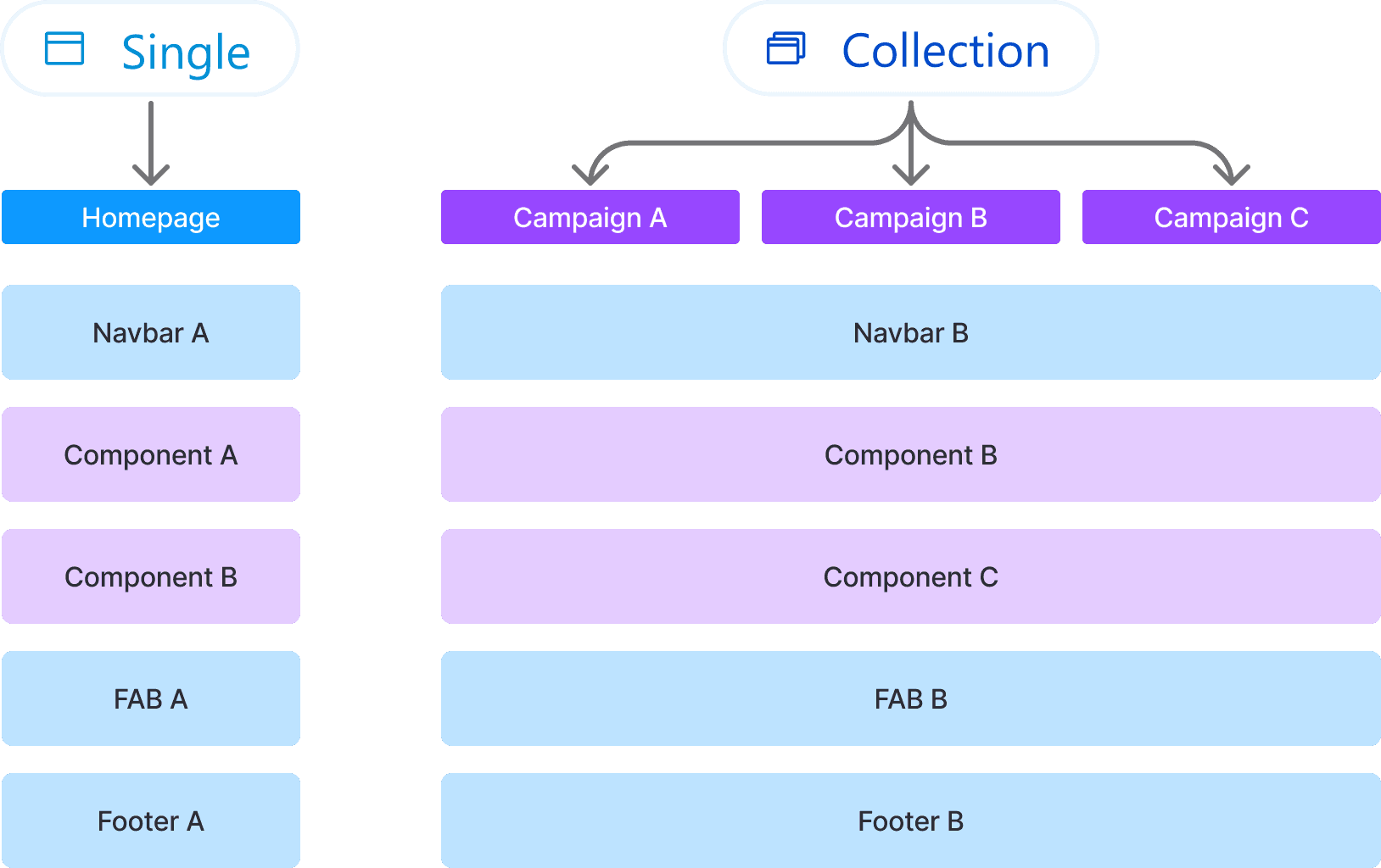
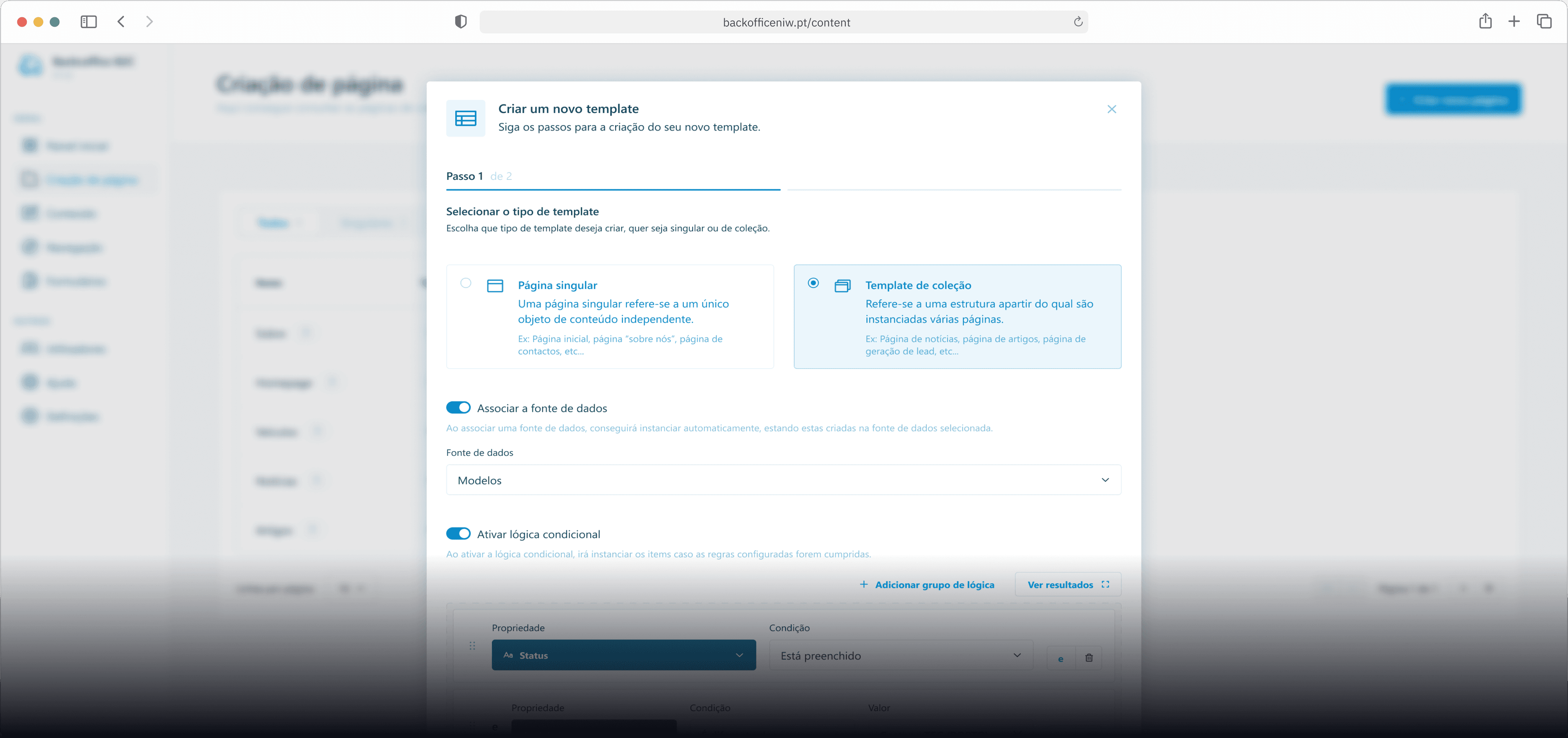
An example showing the difference between single page templates (unique component structure) and collection templates (repeated component structure).

Template properties creation and usage in a campaign collection example.

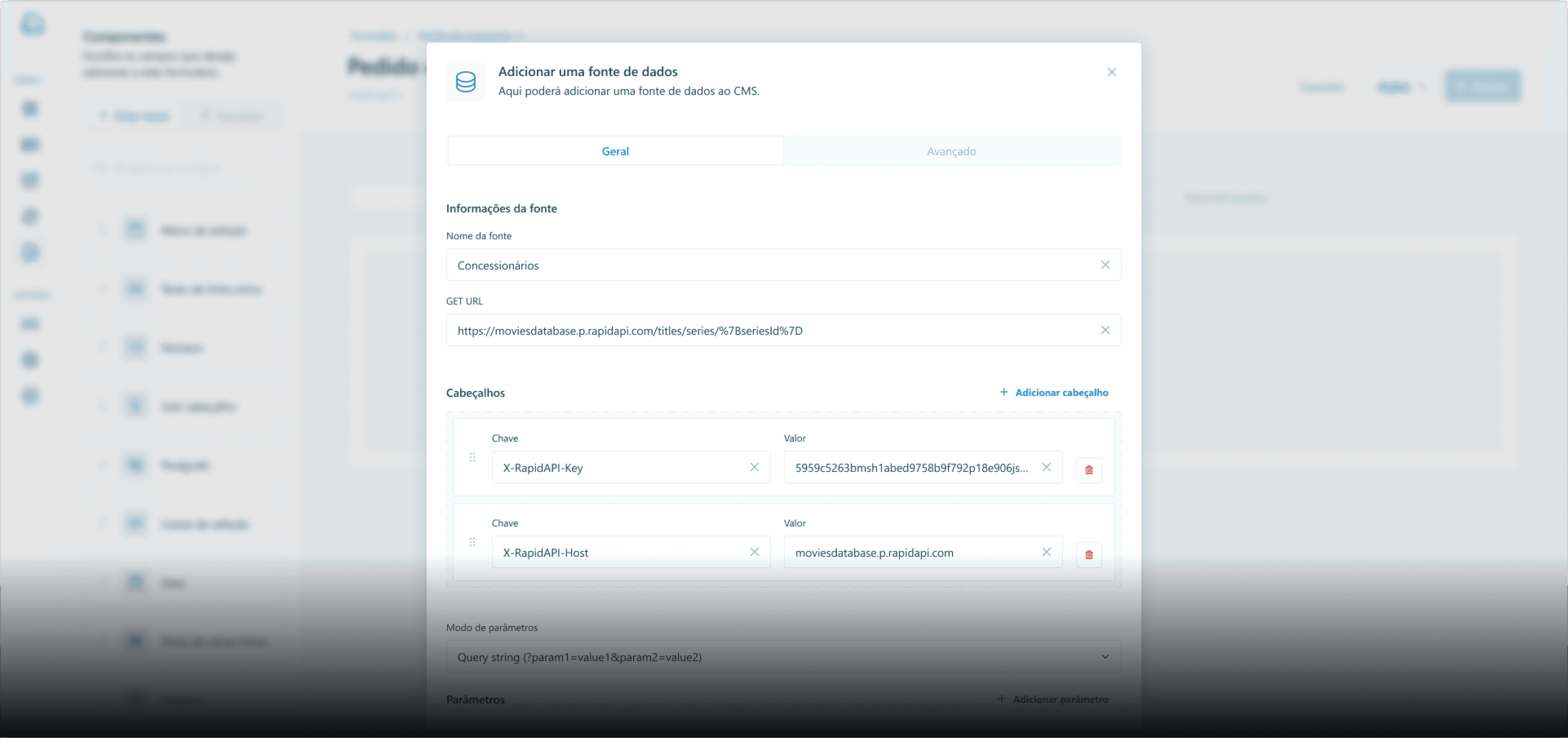
Template external data source properties and usage in a campaign collection example.

🚪 Framing the walls

Based on the insights gathered from the Competitive Analysis, User Persona and the feature prioritization It was time to start iterating.

🚪 Framing the walls

Based on the insights gathered from the Competitive Analysis, User Persona and the feature prioritization It was time to start iterating.

🚪 Framing the walls

Based on the insights gathered from the Competitive Analysis, User Persona and the feature prioritization It was time to start iterating.

Info

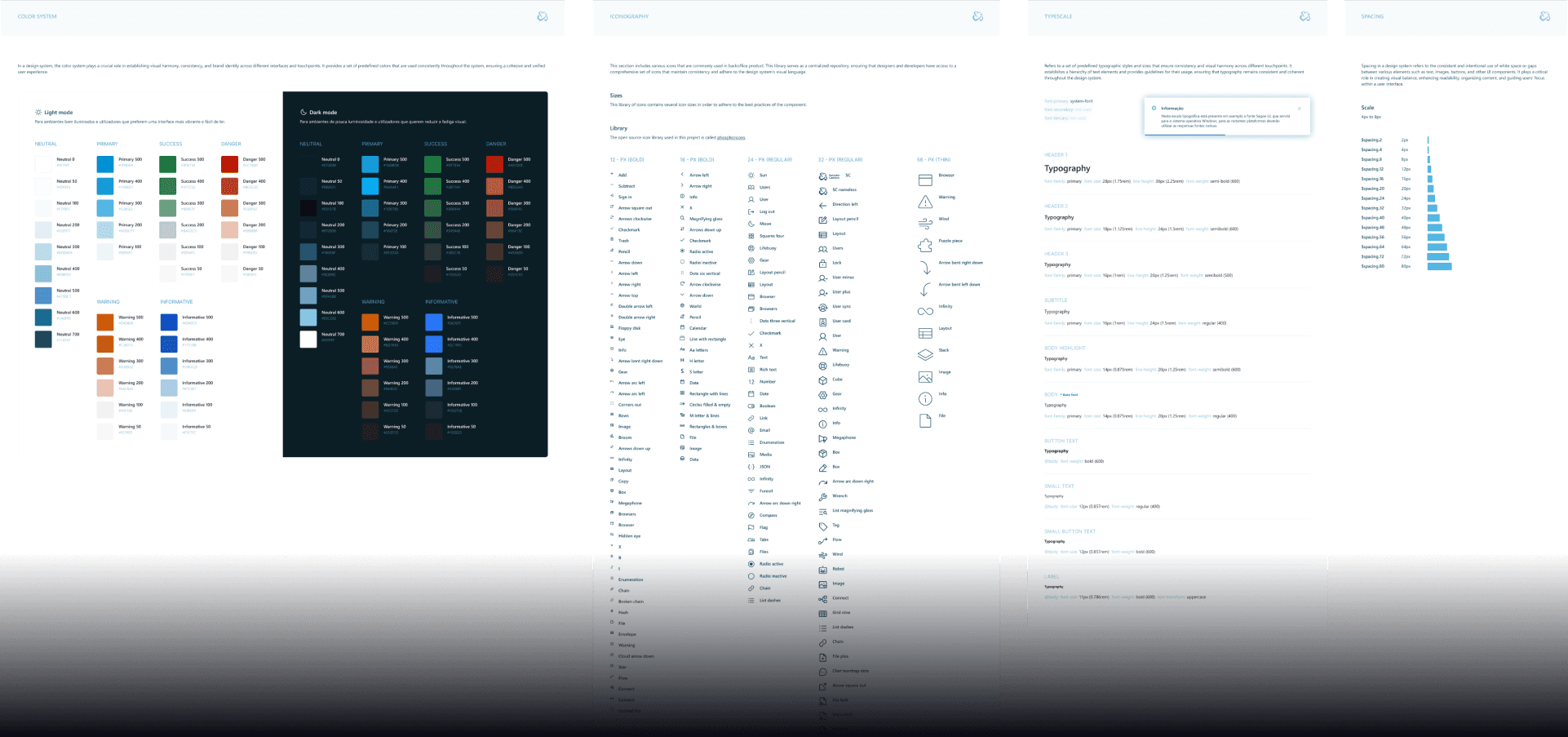
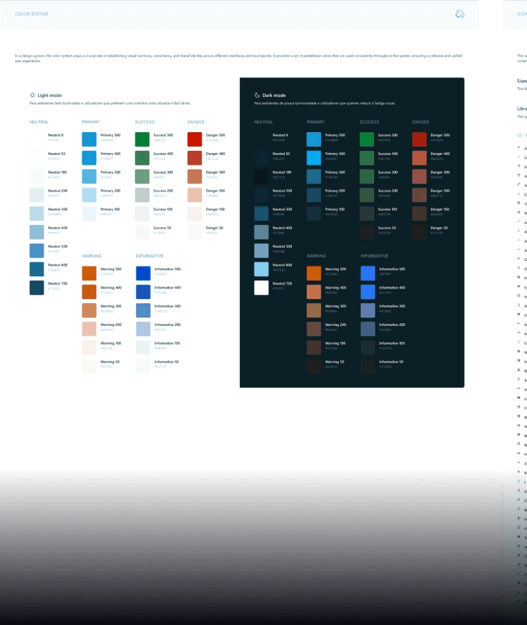
Embracing atomic design principles allowed us to effectively manage design debt, maintain consistency, and promote scalability within our layout, ultimately enhancing the overall quality and coherence of our product.

Info

Embracing atomic design principles allowed us to effectively manage design debt, maintain consistency, and promote scalability within our layout, ultimately enhancing the overall quality and coherence of our product.

Info

Embracing atomic design principles allowed us to effectively manage design debt, maintain consistency, and promote scalability within our layout, ultimately enhancing the overall quality and coherence of our product.

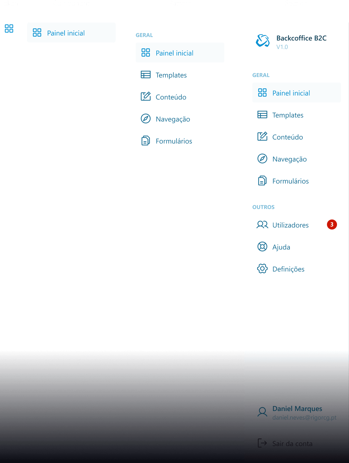
A practical example of the atomic design principle used in the CMS project.

Atomic Design Principles and Variables

Following the atomic design methodology, we broke down our layout components into their smallest, most elemental forms, akin to atoms. This granular approach facilitated modular design, allowing us to construct interfaces from these fundamental building blocks.

Iterating on the layouts

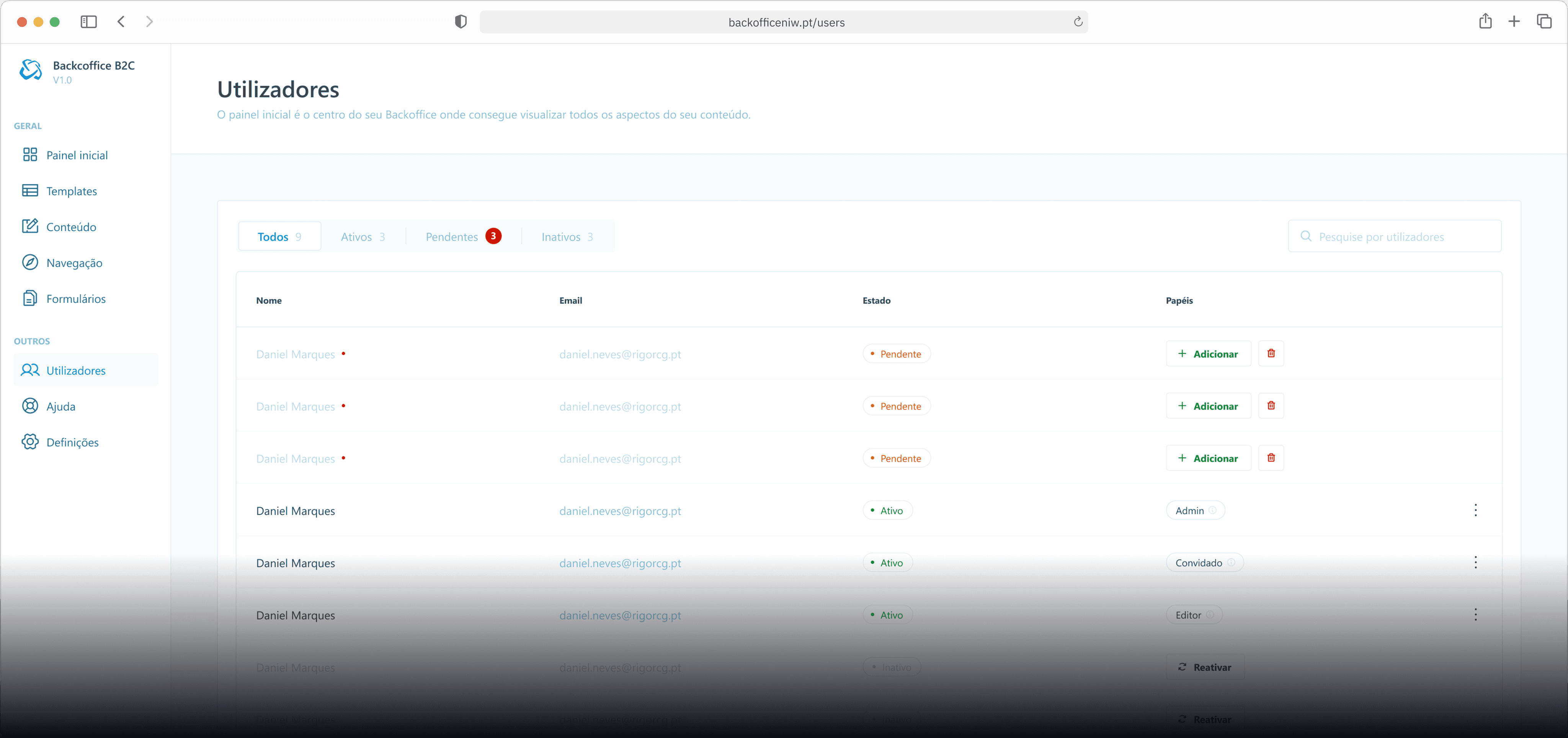
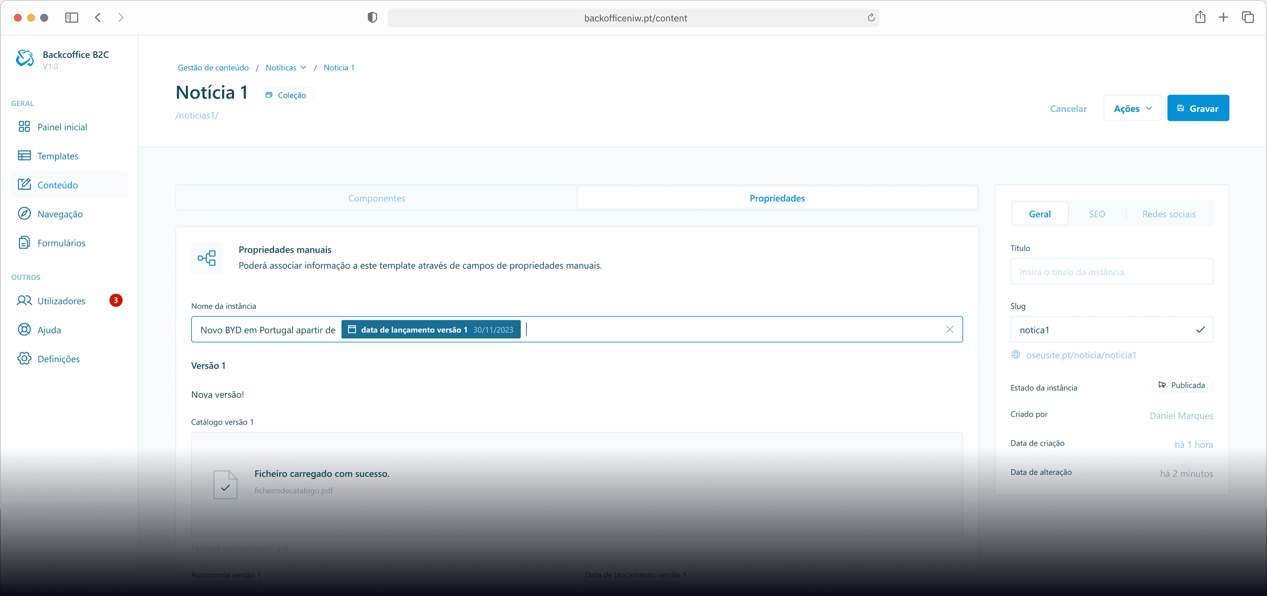
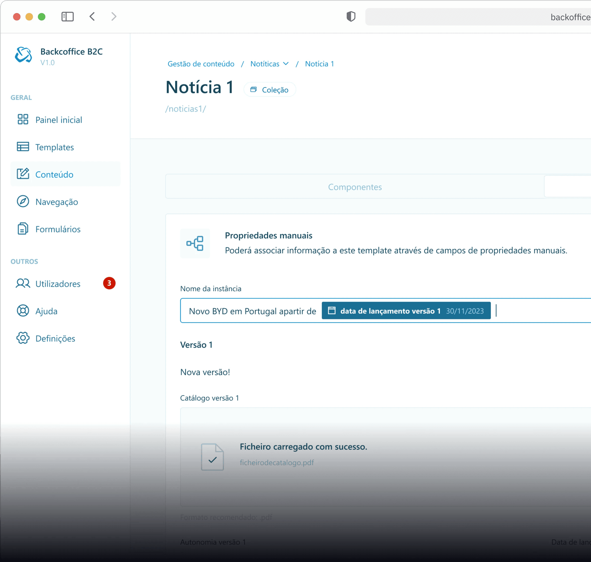
I then started working on the first version of the layouts. Some layouts would later on be changed due to insights gained from usability testing.

Info

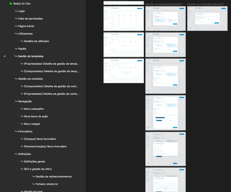
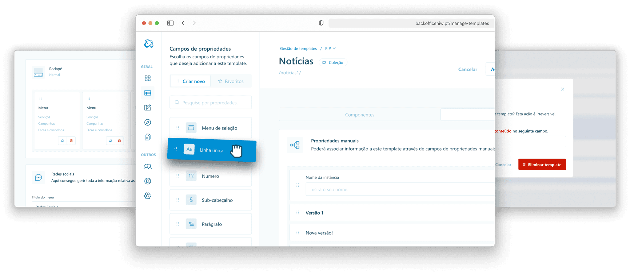
The project got to a scale that we had to separate the figma file into pages per features. This also proved useful to the development team since they could quickly search for the feature at hand.

Info

The project got to a scale that we had to separate the figma file into pages per features. This also proved useful to the development team since they could quickly search for the feature at hand.

Info

The project got to a scale that we had to separate the figma file into pages per features. This also proved useful to the development team since they could quickly search for the feature at hand.

An example of the layout listing pages.

Info

Unfortunately we were only able to do usability testing after some features were developed and not with a prototype, that led to some design debt.

Info

Unfortunately we were only able to do usability testing after some features were developed and not with a prototype, that led to some design debt.

Info

Unfortunately we were only able to do usability testing after some features were developed and not with a prototype, that led to some design debt.

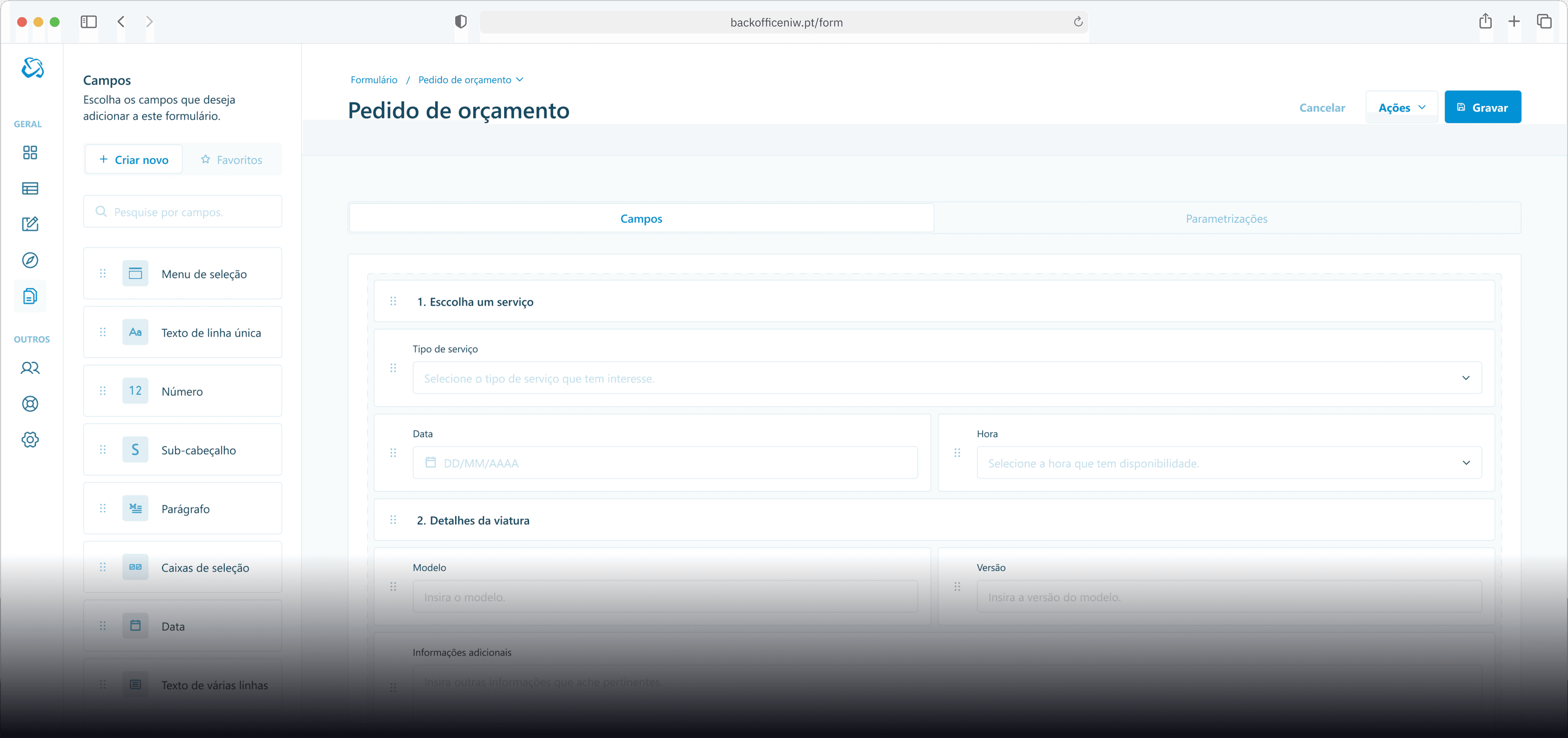
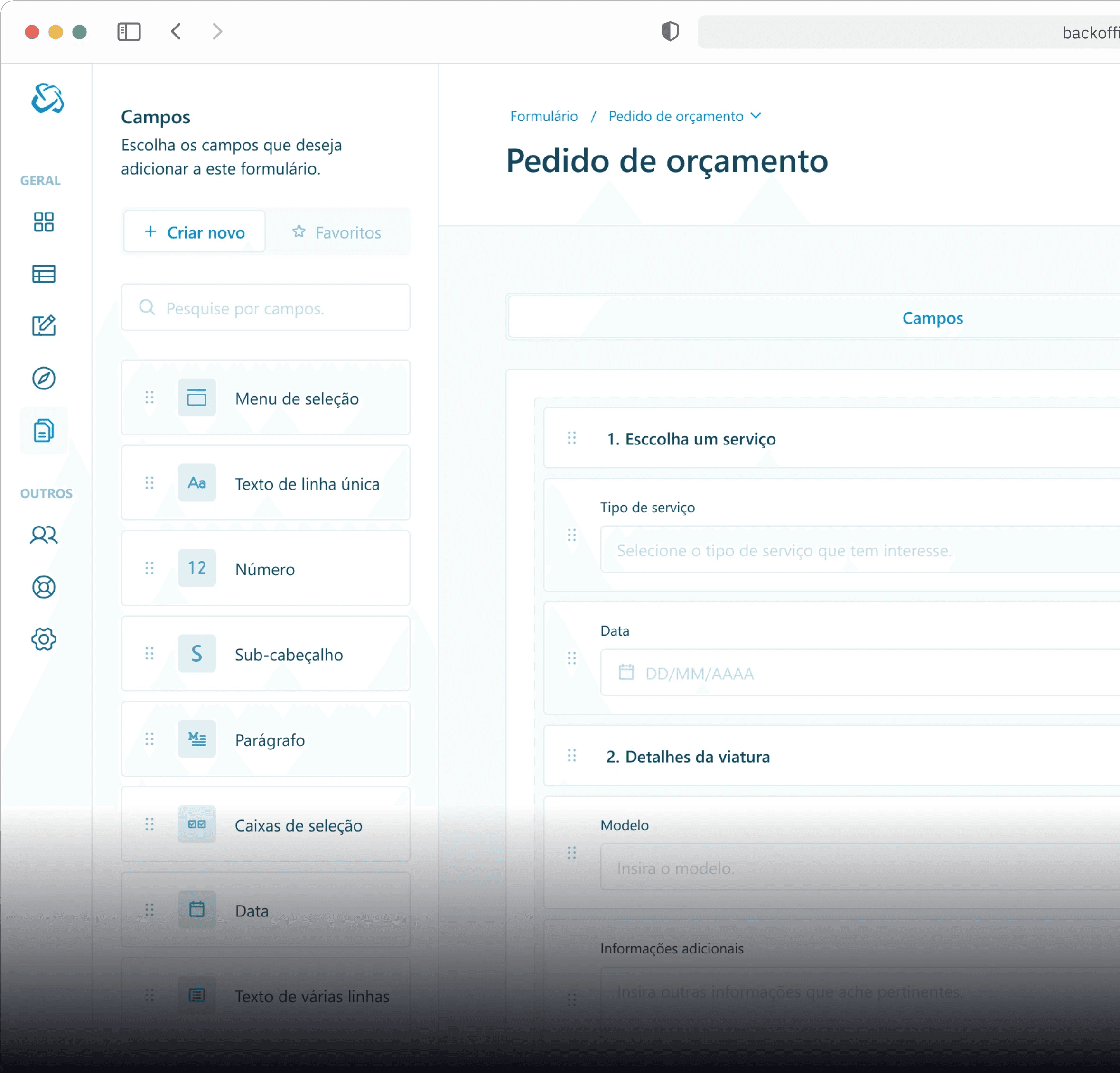
An example of the figma prototype done.

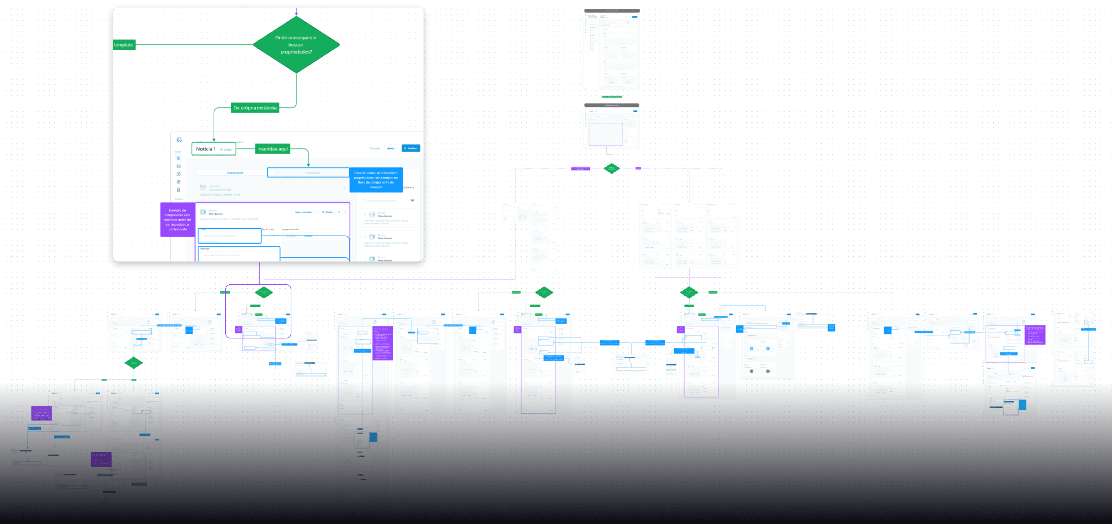
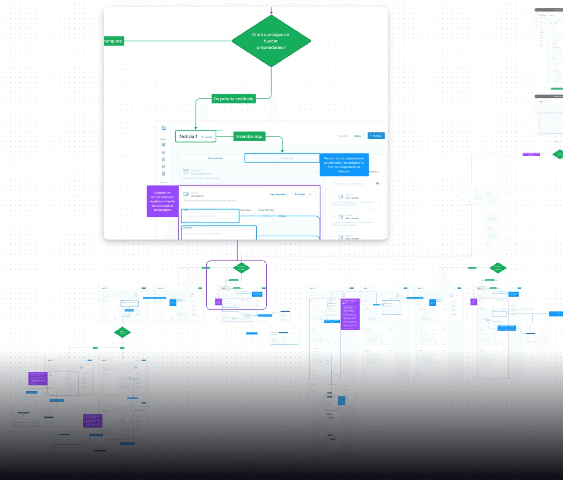
Userflows and prototypes for defining more complex feature logic

Userflows and prototypes served as a guiding light to the developer team, to ensure consistency for future and previous established logic.

🌊 Testing the waters

Our primary goal is to ensure that our product not only meets but exceeds the expectations and needs of our users. To achieve this, we initiated several comprehensive usability tests aimed at gathering valuable insights to enhance the user experience.

🌊 Testing the waters

Our primary goal is to ensure that our product not only meets but exceeds the expectations and needs of our users. To achieve this, we initiated several comprehensive usability tests aimed at gathering valuable insights to enhance the user experience.

🌊 Testing the waters

Our primary goal is to ensure that our product not only meets but exceeds the expectations and needs of our users. To achieve this, we initiated several comprehensive usability tests aimed at gathering valuable insights to enhance the user experience.

We were able to get in contact with users who would eventualy use the actual product for our moderated usability test, and these were some insights that we've gathered.

From this usability test, we were able to find new improvements we could make to the CMS in order to improve it's user experience, below you’ll find some of the suggestions, and the reasoning behind them.

78 %

of tasks were completed including all the users and tasks performed.

More information

78 %

of tasks were completed including all the users and tasks performed.

More information

78 %

of tasks were completed including all the users and tasks performed.

More information

Template management to instance

Reasoning

Around 80% of users had moderate difficulty finding content management after creating a template. With the addition of the functionality to generate instances based on the index of data sources, by selecting “Save and manage content” the user will immediately to the instance listing page.

Suggestion

  • Switch buttons position from "Save and manage content" with "Save".

  • Change button copy from "Save" to "Save only".

Template navbar selection modal

Reasoning

When given the task "Create a new navbar", around 75% people went directly to creating instances and only then discovered how to create a new header through the sidebar. The focus of this hypothesis is to smooth out the Header/Action Bar/Footer creation.

Suggestion

If the user wants to create a new Header/Action Bar/Footer, add a Secondary CTA so that the user can be redirected to the Header/Action Bar/Footer creation page.

Instance form selection

Reasoning

Users had some difficulty finding the form creation page when using the navigation bar. With this change we want to test the hypothesis of smoothing the flow of associating a form with a component, as well as creating a new form flow.

Suggestion

The user now has the possibility, by selecting “+ Add form”, to create a new form, if they have not created one or just want to create another, or add a form if they have already created it.

Form builder

Reasoning

50% of users felt the need to look for the field duplication feature. This functionality serves to speed up the creation of forms with less effort.

Suggestion

When hovering, the user now has the possibility of duplicating the selected field.

Form builder

Reasoning

50% of users felt the need to look for the field duplication feature. This functionality serves to speed up the creation of forms with less effort.

Suggestion

When hovering, the user now has the possibility of duplicating the selected field.

Form builder

Reasoning

50% of users felt the need to look for the field duplication feature. This functionality serves to speed up the creation of forms with less effort.

Suggestion

When hovering, the user now has the possibility of duplicating the selected field.

Form field settings

Reasoning

Most users felt some frustration when trying to replicate a form field with an integrated label (Material Design), as they visually do not appear to have a label. This change shows that it is a mandatory field, whereas previously the primary CTA was disabled, without providing context for the error.

Suggestion

  • Primary CTA will always be enabled.

  • Mandatory fields will show error states.

Footer menu modal

Reasoning

88% of users had some difficulty building a footer menu due to not being able to map the fields to it's meaning. By rearranging the search field, it becomes clearer that it will feeds the menu links. Adding the menu preview (similar to the form field modal), the user can the changes see in real time, adding a more cohesive and enjoyable experience.

Suggestion

  • Rearrange the search bar to be closer to the menu links

  • Add a menu preview (similar to the form field modal)

Following the moderated usability test, we implemented some improvements listed above to validate my hypothesis.

- 40%

Template management to instance

More information

- 40%

Template management to instance

More information

- 40%

Template management to instance

More information

- 24%

Template navbar selection modal

More information

- 24%

Template navbar selection modal

More information

- 24%

Template navbar selection modal

More information

💭 Time to reflect

This project has been an eye-opening experience in the realm of true collaborative teamwork, highlighting the importance of mutual support among colleagues who have transformed into genuine advocates for our product's user experience. Witnessing the tangible impact of design on business success, particularly in the significant reduction of support tickets post-adoption of our new CMS, has reaffirmed my belief in the power of thoughtful design.


On a more technical note, this endeavor has rigorously tested my skills in crafting scalable and modular products. Rejecting the notion of a single-point handoff process, I firmly believe in fostering a continuous and collaborative workflow—a principle I successfully implemented throughout this project. As I reflect on the journey, I am reminded of the invaluable lessons learned and the immense satisfaction derived from tackling complex challenges alongside a dedicated team.

🎉 Team credits

Some of the extraordinary people behind this project.

  • Bruno Teixeira (Digital Product Solutions Team Leader)

  • Tiago Ferreira (Tech Delivery Manager)

  • Ivan Hirskyy (Front-End Developer)

  • João Vasconcelos (Front-End Developer)

  • Bruno Braga (Tech Lead)


And many more…
Designed in Figma and implemented in Framer by Daniel Marques.

Designed in Figma and implemented in Framer by Daniel Marques.

Designed in Figma and implemented in Framer by Daniel Marques.